UGURUS offers elite coaching and mentorship for agency owners looking to grow. Start with the free Agency Accelerator today.
The text-rendering property in CSS allows you to choose quality of text over speed (or vice versa) allowing you to fine tune optimization by suggesting to the browser as to how it should render text on the screen. Said another way in MDN:
The
text-renderingCSS property provides information to the rendering engine about what to optimize for when rendering text. The browser makes trade-offs among speed, legibility, and geometric precision.
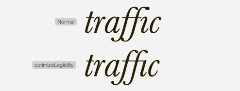
You can see some before/after examples here. Sometimes the result is just straight up better kerning:

The text-rendering property is not defined in any CSS standard. It’s actually an SVG property. However, Gecko/WebKit/Blink browsers let you apply this property to HTML elements.
Be aware that Windows, Linux and OS X each (may) have different text-rendering engines. Not to mention that different browsers each have their own text rendering defaults, so there is no guarantee that your font treatments will be displayed as intended on the user’s system. You can learn more about type rendering systems and operating systems on the Typekit blog.
There are four possible values:
- auto (default) – The browser makes educated guesses about when to optimize for speed, legibility, and geometric precision while drawing text. Be aware that different browsers interpret this value differently.
- optimizeSpeed – The browser emphasizes rendering speed over legibility and geometric precision when drawing text. It disables kerning and ligatures.
- optimizeLegibility – The browser emphasizes legibility over rendering speed and geometric precision. This enables the use of special kerning and optional ligature information that may be contained in the font file for certain fonts.
- geometricPrecision – The browser emphasizes geometric precision over rendering speed and legibility. Certain aspects of fonts—such as kerning—don’t scale linearly, so
geometricPrecisioncan make text using those fonts look good. When SVG font is scaled, the browser calculates pixel size, then rounds to the nearest integer. ThegeometricPrecisionproperty allows for more fluid scaling. Note: Only WebKit browsers apply this fluid value, Gecko treats the value just likeoptimizeLegibility.
< 20px enables ligatures
The optimizeLegibility keyword enables ligatures in text smaller than 20px for some fonts. (like Calibri or DéjàVu) This 20px threshold value can be changed in Gecko via the browser.display.auto_quality_min_font_size user preference.
Ligatures are combinations of letters that tend to look better and are more readable as a combined glyph. An example of this is the letters ‘f’ and ‘i’. They can form the ligature ‘fi’ as in the word ‘find’. You can learn more about them here.

Some font files contain additional information about how the font should be rendered. optimizeLegibility makes use of this information, and optimizeSpeed does not.
Example
p.legibility {
  text-rendering: optimizeLegibility;
}
p.speed {
  text-rendering: optimizeSpeed;
}
Performance
When it is said that there is a tradeoff between speed and precision, they aren’t kidding. There can be significant performance issues to consider. That article is worth quoting entirely:
There are actually significant, effectively fatal performance problems (such as 30-second loading delays, or longer) on mobile devices when using optimizeLegibility for long pages. Apply it only if you know what the maximum text length will be. (Also, avoid using it for Android clients, at least on the older versions that everyone still uses: its font renderer often has very strange bugs when this mode is enabled.)
I did some testing with Instapaper to determine approximate optimizeLegibility performance limits. A 5,000-word article in Instapaper for iOS, for instance, will only use optimizeLegibility on devices with an A5-class or greater CPU. To avoid problems on older iOS devices, I wouldn’t recommend using optimizeLegibility blindly and unconditionally on any pages longer than about 1,000 words. And I wouldn’t recommend enabling it on Android at all.
It’s tempting to do:
/* Probably not advisable */
body {
  text-rendering: optimizeLegibility;
}
But be darn careful about that, seems dangerous especially when applied to an arbitrary page.
Browser Support
| Chrome | Safari | Firefox | Opera | IE | Android | iOS |
|---|---|---|---|---|---|---|
| 4+ | 5+ | 3+ | Maybe post-Blink? | Nope | 2.3+? | 3+? |
There are various bugs. Android issue with new lines. Chrome has various, including letter-spacing. Safari (and others) default to optimizeSpeed rather than determining on the fly.

Hey Chris,
Not sure about that because my English is Rusty, but I think there is a word (or two) missing in your first sentence.
Anyway, good stuff, as always !
He’s right, you know:
Good article – particularly the notes on its performance. My preference is to use on pull quotes and headlines in magazine-style layouts.
thanks fixing.
If you don´t like ligatures there is the property
font-variant-ligatures: noneorfont-feature-settings: nonefor disabled them.But Css ligatures are “fun” [es-es]
Just wanted to point out, optimizeLegibility renders empty paragraphs in Safari 5.1.7 for Windows. Text is still in the DOM, just not displayed (paragraph is fully collapsed). Font is Open Sans.
HI Adam,
I also faced the same problem, can I know how did you fixed it?
Thanks in advance
Nitesh Mittal“
I had this problem with the combination of Helvetica Nue font. So after changing the value to auto, the texts are showing well on Safari browser.
Therefore, this css property won’t work for some fonts. That’s why we should always test our site on different browsers and devices. :)
Thank you @Adam!
FYI: This is broken in Android 4.3 (and maby 4.2?), so you would probably have to use some kind of User Agent Sniffing to fix that.
The font I use for my blog has pretty nice kerning and ligatures, so I am pretty confident of using the following (requires modernizr):
Optimize speed just for touch devices.
html:not(.touch) or initial value for .touch would be better.