UGURUS offers elite coaching and mentorship for agency owners looking to grow. Start with the free Agency Accelerator today.
The grid-column CSS property is a shorthand that specifies the column grid lines where a grid item starts and ends in a grid layout in one declaration.
.grid-container {
  display: grid;
  grid-template-columns: repeat(4, 1fr);
}

.grid-item:nth-child(2) {
  grid-column: 3 / 5; /* Starts on the third column line and ends on the fifth column line */
}
Because of CSS Grid’s default auto-placement behavior, the second child element of the grid in this example would normally be placed in the second column of the grid’s first row. But since we declared grid-column and set it to align the grid item’s starting edge with the third grid line and its ending edge with the fifth grid line, the item to spans the third and fourth columns instead of a single column.
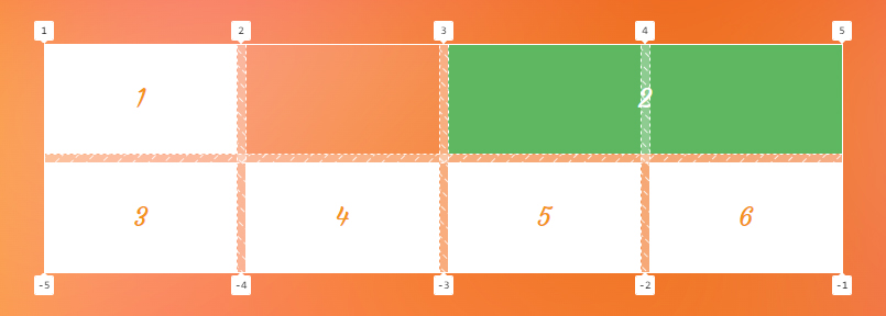
grid-column CSS Grid property.Constituent properties
As mentioned, the grid-column property is a shorthand that combines two properties:
grid-column-start
.element { grid-column-start: 3; }
grid-column-end
.element { grid-column-end: 4; }
Syntax
grid-column: <grid-line> [ / <grid-line> ]?Full definition
<grid-line> =
  auto |
  <custom-ident> |
  [ [ <integer [−∞,−1]> | <integer [1,∞]> ] && <custom-ident>? ] |
[ span && [ <integer [1,∞]> || <custom-ident> ] ]- Initial value:
auto - Applies to: grid items and absolutely-positioned boxes whose containing block is a grid container
- Inherited: no
- Computed value: as specified for its longhand properties
- Animation type: discrete
This property can take two values separated by a forward slash (/). The value before the slash sets the grid-column-start property, while the value after the slash sets the grid-column-end property. You can declare a single value without the slash which applies to the grid-column-start property, and sets the grid-column-end property to auto.
Values
/* Keyword value */
grid-column: auto;

/* <custom-ident> value */
grid-column: myLineName;
grid-column: myGridArea;
grid-column: sidebar-start / main-end;

/* <integer> + <custom-ident> values */
grid-column: 3;
grid-column: 2 / -3;
grid-column: main 2;
grid-column: 3 line / 5 line;

/* span + <integer> + <custom-ident> values */
grid-column: span 3;
grid-column: span 2 / 5;
grid-column: 1 / span myline;
grid-column: 2 / span gridline 3;

/* Global values */
grid-column: inherit;
grid-column: initial; /* same as `auto` */
grid-column: revert;
grid-column: revert-layer;
grid-column: unset;
auto
This is the default value. It indicates the default span (1) and auto-placement behavior, which means the grid item is automatically placed in the next available empty grid cell.
<custom-ident>
This syntax allows you to either use an integer to refer to a numbered grid line or a string to refer to a named grid line or a named grid area. In other words, you can specify a grid line by its numerical index or name to the starting and the ending edge of a grid item.
Positioning Items by line numbers
There are two grid lines before and after each grid track with a numerical index assigned to them automatically, starting from number one.
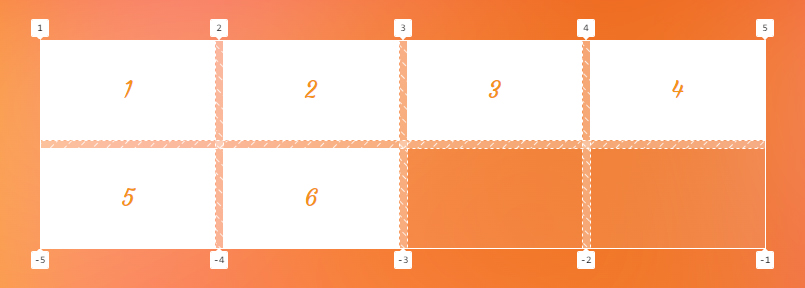
In the first example of this article, we used this syntax to refer to the third grid line by its index (3) which aligns the starting edge of the grid item with the starting edge of the third column, while its ending edge is aligned with the fifth column using the <custom-ident> syntax:
.grid-item:nth-child(2) {
  grid-column: 3 / 5;
}
Note that you can also use a negative number to refer to a grid line, but it counts starting from the ending edge of the grid. The following code points to the same grid lines in the previous example, but counting in reverse:
.grid-item:nth-child(2) {
  grid-column: -3 / -1; /* same as: grid-column: 3 / 5; */
}
Notice the negative integers have been assigned to our grid as well as positive ones:

grid-column CSS propertyPositioning items by line names
You can assign a custom name to a grid line using the grid-template-columns and grid-template-rows line-based placement grid properties to refer to that line by its name.
Let’s go back to our example and name all its column track lines like the following declaration:
.grid {
  display: grid;
  grid-template-columns: [first] 1fr [second] 1fr [third] 1fr [fourth] 1fr [last];
}
We can refer to the third and the fifth line by our custom names instead of their index:
.grid-item:nth-child(2) {
  grid-column: third / last; /* same as index numbers 3 / 5 */
}
Note that the <custom-ident> cannot take the span value. span is a reserved keyword for grid placement properties (e.g. grid-column: 1 / span 2).
Positioning items by grid areas
When defining grid areas using the grid-template-areas property, you get implicit line names for free based on the name of the areas. For instance, a grid area with the name content generates a line named content-start before it and one named content-end after it. You can refer to these lines to set the position of a grid item.
.grid-item:nth-child(2) {
  grid-column: content-start / content-end;
}
Alternately, you can refer to the area’s name to position an item at the starting and ending line of the content named area:
.grid-item:nth-child(2) {
  grid-column: content;
}
Here is a full example:
<body>
  <main></main>
  <aside></aside>
</body>
body {
display: grid;
grid-template-columns: 1fr 1fr 1fr;
grid-template-areas: "content content sidebar";
}
main {
grid-column: content;
}This sets the position of the <main> element to the content area in our grid.
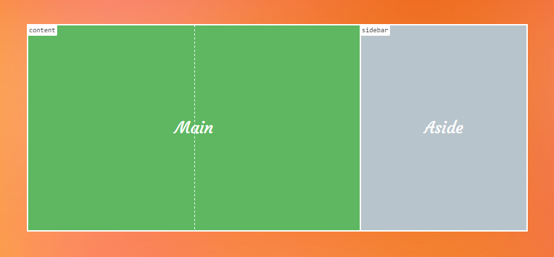
grid-column CSS property.<integer> && <custom-ident>?
This flavor of syntax allows you to position grid items by grid lines when there are repeated names. If there are grid lines with the same name, this syntax helps specify which of those lines you are referring to.
.grid {
  display: grid;
  grid-template-columns: [bar] 1fr [foo] 1fr [bar] 300px [bar];

  /*
    Using repeat() function also gives you repeated named grid line, for example:
    grid-template-columns: repeat(3, [bar] 1fr);
  */
}
Let’s assume you want to choose the third line, but that line has the same name as the first and the last grid line — all of them are called bar. Since the second line named bar is the third grid line, you can use 2 to select it as the starting point:
.grid-item:nth-child(2) {
  grid-column: 2 bar; /* The second `bar` named line which is the third line */

  /* This is equivalent to */
  grid-column-start: 2 bar;
  grid-column-end: auto;
}
Note that the order doesn’t matter, so the previous code can also be written like this as well:
.grid-item:nth-child(2) {
  grid-column: bar 2;
}
Like the previous syntax, you can use a negative integer to count the grid lines starting from the end edge of the grid too. In our example, if we want to refer to the first bar, we can count starting from the ending edge of our grid and write it like this:
.grid-item:nth-child(2) {
  grid-column: -3 bar;
}
Note that the integer value cannot be zero.
span && [ <integer> || <custom-ident> ]
This syntax allows a grid item to span across the grid tracks. It can be specified in three different ways.
Note that if the integer is not specified anywhere in this syntax — the default value is 1.
span <integer>
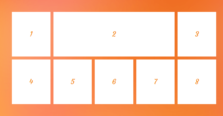
Using the span keyword followed by an integer indicates the number of tracks a grid item spans from a specific grid line. For example, if we want a grid item to span three column tracks towards its ending edge, we can apply the following value:
.grid-item:nth-child(2) {
  grid-column: auto / span 3;
}
grid-column CSS property.span <custom-ident>
It’s also possible to combine the span keyword with the name of a grid line to make the grid item expand until it reaches that specified grid line.
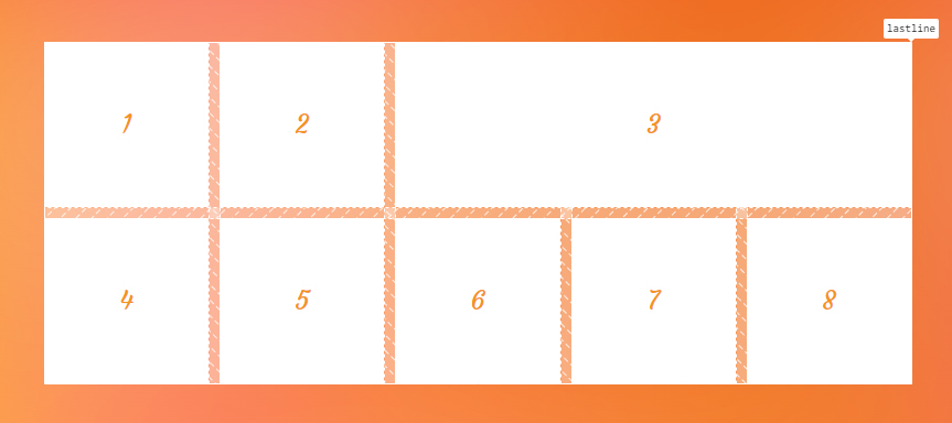
.grid-item:nth-child(3) {
  grid-column: 3 / span lastline;
}
Since the starting line of the grid item is known (3), we can span the item until it hits a grid line named lastline.
grid-column CSS property.span <custom-ident> <integer>
If the specified grid line name is assigned to more than one grid line — in other words, if we have repeated named grid lines — we need to say which ones we want to target. To do that, we can add an integer to our value specifying which grid line we are referring to.
Take the following grid as an example:
.grid-container {
  display: grid;
  grid-template-columns: [y] 1fr [x] 1fr [x] 1fr [y] 1fr [x] 1fr [x];
}

.grid-item:nth-child(3) {
  grid-column: 2 /span x 2;
}
We set the starting line of the grid item to the second line. Then we want it to span forward until it hits a grid line named x. And since we want it to be the second x grid line, we wind up with span x 2.
As a result, our grid item spans from the second line, as illustrated below. The first line that it hits is the first one, x, followed by y, and finally, it hits the desired second line, named x.
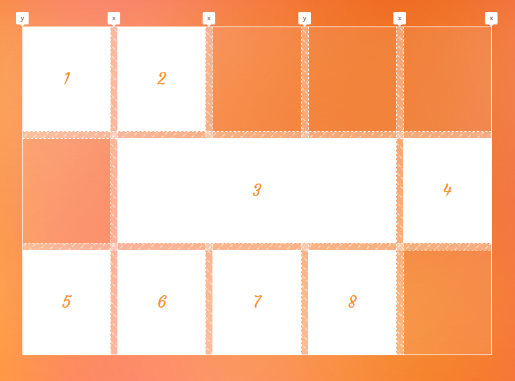
x using the grid-column CSS propertyThis syntax is helpful when you want to span a grid item towards a grid line using its name. But beware aware that there is more than one grid line with the same name using this method, so we add an integer to say we want the N of that grid line.
See grid-column-start and grid-column-end for more information and examples of the syntax of these individual properties.
Examples
Let’s look at a few different scenarios where grid-column can be used.
Full bleed layout
Sometimes we want our text to be narrowed and centered but an element like an image or a video extends to the edge of the viewport. This kind of layout is called full bleed layout.

Consider the following HTML:
<article>
  <h1></h1>
  <p></p>
  <img src="bridge.webp" alt="A brightly-lot floating bridge against the night sky.">
  <p></p>
</article>
In order to create this layout using CSS Grid, we setup a three-column grid:
article {
  display: grid;
  grid-template-columns: 1fr min(60ch, 100%) 1fr;
}
Now, we need to place all the children of the <article> into the second column, and align the starting edge of the <img> with the first grid line and its ending edge with the last line:
article > * {
  grid-column: 2 / 3;
}
article > img {
  grid-column: 1 / -1;
}
You can see the result in the following image:
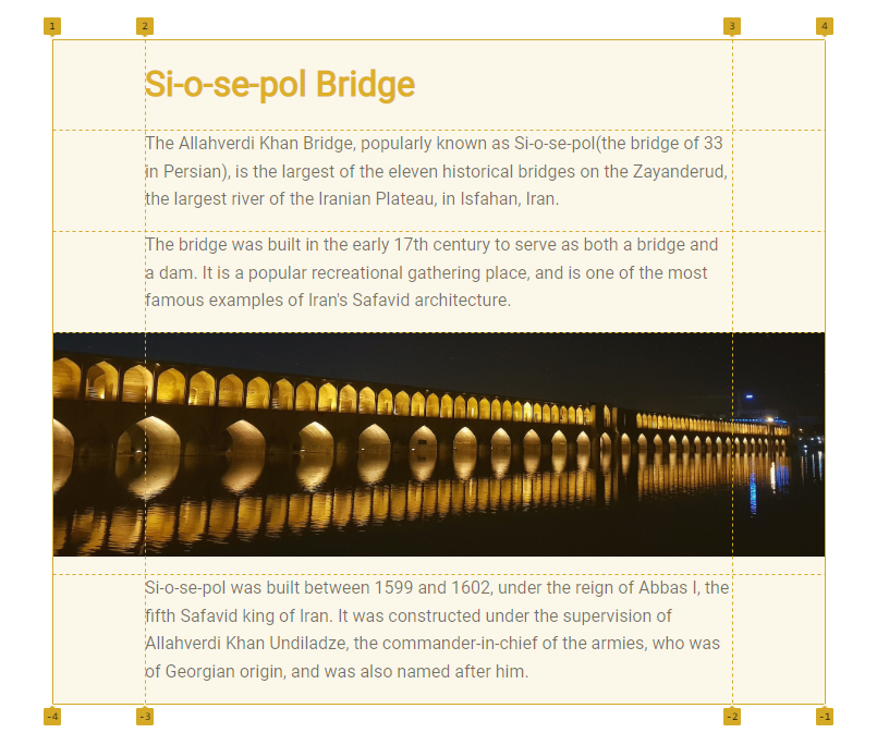
grid-column CSS property Setting the image element to span across all grid columns while other elements are in the second column.The whole snippet for a full bleed layout is the following CSS code:
.content {
  display: grid;
  grid-template-columns: 1fr min(60ch, 100%) 1fr;
}
.content > * {
  grid-column: 2 / 3;
}
.full-bleed {
  grid-column: 1 / -1;
}Stacking grid items
When positioning items across the grid, we can stack or overlap them on top of each other. This gives us the ability to sometimes use CSS Grid as an alternative to absolute positioning. For instance, we can put a caption layer on top of an image without using the position property as demonstrated below:
<figure>
  <img src="image.png" alt="how dare you leave alt empty?">
  <figcaption>The caption of our image</figcaption>
</figure>
figure {
display: grid;
}
img,
figcaption {
grid-column: 1 / -1;
grid-row: 1 / -1;
}Here’s what we get:

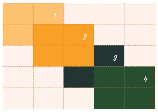
By default, grid items stack in the source order, but you can control their level using the z-index property. In the following example, we overlap some items and we use the z-index property to bring the second item to the highest level in the stacking context:
.item:nth-child(2) {
  grid-column: 2 / 4;
  grid-row: 2 / 4;
  z-index: 1;
}
z-index CSS propertyAccessibility
One thing to note when using the grid placement properties is the issue caused by rearranging the items. When you change the position of an item, only the visual order of the grid items changes, and that order might not be the same as the original document order. This may cause a very bad experience for someone tabbing through the document on a keyboard or listening to a screen reader that reads the content in the same order as the HTML.
So, avoid changing the order of grid items when the HTML order of the elements matters. For example, it can be good for a random image gallery but perhaps not so much for your form inputs.
However, at the time of this writing, there is a proposal to tackle this issue that will hopefully resolve this concern in the future.
Demo
You can change the value of grid placement properties in the demo to see what happens to the third grid item:
Browser support
More information
- CSS Grid Layout Module Level 1 (W3C)
- CSS Grid Layout: Introduction (DigitalOcean)
- Placing, Spanning, and Density in CSS Grid (DigitalOcean)
Related guides
Related
column-gap
.example { column-gap: 25px; }
display
.element { display: inline-block; }
gap
.element { gap: 20px 30px; }
grid-auto-columns
.element { grid-auto-columns: minmax(100px, 200px); }
grid-auto-flow
.element { grid-auto-flow: dense; }
grid-column-end
.element { grid-column-end: 4; }
grid-column-start
.element { grid-column-start: 3; }
grid-template
.element { grid-template: 100px 1fr / 300px 1fr; }
grid-template-areas
.element { grid-template-areas: "header header" "sidebar main"; }
grid-template-columns
.element { grid-template-columns: 300px 1fr; }
