UGURUS offers elite coaching and mentorship for agency owners looking to grow. Start with the free Agency Accelerator today.
The grid-template-rows CSS property is part of the CSS Grid Layout specification, defining the rows of a grid container by specifying the size of the grid tracks and its line names.
.app-layout {
  display: grid;
  grid-template-rows: auto 1fr auto;
}
One thing to cover before we jump into the grid-template-rows property is the difference between grid lines and grid tracks. Grid lines refer to the names of the lines that define the grid’s columns and rows. Grid tracks refer to the length of space between grid lines.
Syntax
grid-template-rows: none | <track-list> | <auto-track-list> | subgrid <line-name-list>?
Full definition
where:
<track-list> = [ <line-names>? [ <track-size> | <track-repeat> ] ]+ <line-names>?
<auto-track-list> = [ <line-names>? [ <fixed-size> | <fixed-repeat> ] ]* <line-names>? <auto-repeat>
[ <line-names>? [ <fixed-size> | <fixed-repeat> ] ]* <line-names>?
<line-name-list> = [ <line-names> | <name-repeat> ]+

where:
<line-names> = '[' <custom-ident>* ']'
<track-size> = <track-breadth> | minmax( <inflexible-breadth> , <track-breadth> ) | fit-content( [ <length> | <percentage> ] )
<track-repeat> = repeat( [ <integer [1,∞]> ] , [ <line-names>? <track-size> ]+ <line-names>? )
<fixed-size> = <fixed-breadth> | minmax( <fixed-breadth> , <track-breadth> ) | minmax( <inflexible-breadth> , <fixed-breadth> )
<fixed-repeat> = repeat( [ <integer [1,∞]> ] , [ <line-names>? <fixed-size> ]+ <line-names>? )
<auto-repeat> = repeat( [ auto-fill | auto-fit ] , [ <line-names>? <fixed-size> ]+ <line-names>? )

where:
<track-breadth> = <length-percentage> | <flex> | min-content | max-content | auto
<inflexible-breadth> = <length> | <percentage> | min-content | max-content | auto
<fixed-breadth> = <length-percentage>- Initial value:
none - Applies to: grid containers
- Inherited: no
- Computed value: as specified, but with relative lengths converted into absolute lengths
- Animation type: simple list of length, percentage, or calc, provided the only differences are in the values of the length, percentage, or calc components in the list.
Values
/* Keyword value */
grid-template-rows: none;

/* <track-list> values */
grid-template-rows: 200px 1fr 180px;
grid-template-rows: [linename col1] 250px [line2];
grid-template-rows: [sidebar] 1fr [content] 2fr;
grid-template-rows: fit-content(50%);
grid-template-rows: minmax(200px, 1fr) minmax(100px, 1fr);
grid-template-rows: repeat(4, 1fr);
grid-template-rows: subgrid;
grid-template-rows: masonry;

/* <auto-track-list> values */
grid-template-rows: 100px repeat(auto-fill, 100px) 200px;
grid-template-rows: 100px repeat(2, 1fr auto) 200px repeat(3, 5fr);
grid-template-rows: minmax(150px, max-content) repeat(auto-fill, 180px) 15%;
grid-template-rows: [col1] 100px [col1-end] repeat(auto-fit, [line3] 400px);

/* Global values */
grid-template-rows: inherit;
grid-template-rows: initial; /* same as `none` */
grid-template-rows: revert;
grid-template-rows: unset;
none
This is the default value. Using the none value means grid-template-rows generates no explicit grid tracks which, in turn, means that rows are implicitly generated (i.e. made for you without having to explicitly define them) and the track sizing is defined by the grid-auto-rows property.
Note that, grid-template-rows is not the only way to create explicit grid row tracks. It can also be done using grid-template-areas property which allows for grid area that can be defined with custom names (e.g. sidebar, main, etc.).
The difference between implicit and explicit grids is nicely summed up in this post by Manuel Matuzovic.
<length>
This value can be any valid and non-negative CSS length, such as px, em and rem , among others to specify the track size (i.e. height) of the row.
<percentage>
This is a non-negative value relative to the inner inline size of the grid container. If the size of the grid container depends on the size of its tracks, then the percentage must be treated the same as declaring auto.
One disadvantage of using a percentage value is that, if you add gaps between the tracks, the size of the gaps will be added to the size of the tracks which may cause an overflow. Use the fr unit or auto keyword to size the tracks and prevent that from happening.
<flex>
This is a non-negative value expressed in fr units and it allows you to create flexible grid tracks by specifying the size of a track as a fraction of the available space in the grid container. That way, as the grid changes heights, so do the rows, making for a more responsive grid.
For example, consider a three-row grid container that’s 900px tall. Let’s say the height of the first (top) row is fixed (i.e. it doesn’t change) at 300px while the second row takes up one fractional unit (1fr) and the third row weighs in at two fractional units (2fr):
.grid {
  display: grid;
  height: 900px;
  grid-template-rows: 300px 1fr 2fr;
}
The second two rows are fractional, so they’re going to take any remaining available space. And, in this case, the available space is whatever is leftover after the first row’s fixed 300px height is taken into account. After that, the second two rows divvy up what’s left according to how many fractions they get.
In this example, the remaining and available space is 600px (i.e. 900px minus 300px). The second rows gets one fraction (1fr) of that space and the third row gets two fractions (2fr). Let’s get math-y for a moment to figure out the height of one fraction of 600px:
1fr = ([Grid Container Height] - [Fixed Row Height]) / [Sum of the flex factors]
1fr = (900px - 300px) / 3
1fr = 600px / 3
1fr = 200px
Aha! One fraction is 200px. And since the second row is 1fr, it must be 200px as well. That leaves us with 400px of available space (900px – 300px – 200px) which just so happens to be twice the size of the second row.
But wait! There’s more.
Remember, a grid takes any gaps that have been added between grid tracks into account when it’s figure out how much available space there is to distribute to the fractional rows. The benefit here, of course, is that our rows will never overflow the grid container.
Let’s add a gap to the previous example:
.grid {
  display: grid;
  height: 900px;
  grid-template-rows: 300px 1fr 2fr;
  gap: 15px;
}
Even though we have declared gap once here, it’s actually like we’ve declared two gaps. That’s because there’s a 15px gap between each row (one between Row 1 and Row 2, and another between Row 2 and Row 3). That means we have 30px worth of gaps in our grid that have to be factored into the available space.
1fr = ([Grid Container Height] - [Gaps] - [Fixed Row Height]) / [Sum of the flex factors]
1fr = (900px - 30px - 300px) / 3
1fr = 570px / 3
1fr = 190px
I don’t know about you, but I don’t like having to do a lot of manual math. That’s what makes CSS grid awesome — it takes of it all!
minmax(min, max)
The minmax() function accepts two arguments: a minimum length value and a maximum length value. And what that tells a grid container is that the grid-template-rows can be no shorter than the minimum value, but no taller than the maximum value. Our Guide to CSS Functions has a more thorough, detailed explanation of how the function works.
Take the following example:
grid-template-rows: 200px minmax(100px, 400px);There are two rows here: one that’s 200px tall, and another that’s expressed as minmax(100px, 400px). Looks weird, right? But all that’s saying is that the second row must take up at least 100px of space, but no more than 400px.
In clearer terms: As long as there’s more than 100px of available space, then the second row can flex up to 400px but has to stop there. Otherwise, the row is 100px tall.
The min and max arguments accept all the following values, except that the min value can’t be a flex value (e.g. 1fr):
<length-percentage> | <flex> | min-content | max-content | autoSo, this is invalid since the min value is a flex value:
/* 👎 */
grid-template-rows: minmax(1fr, 500px) 3fr;
But these are totally valid:
/* 👍 */
grid-template-rows: minmax(auto, 1fr) 3fr;
grid-template-rows: minmax(200%, 1fr) 1fr;
auto
The auto keyword behaves similarly to minmax(min-content, max-content) in most cases.
Since auto track sizes can be stretched by the align-content and justify-content properties, they will take up any remaining space in the grid container by default auto-matically. That said, auto track sizes can’t win a fight against fr units when allocating the remaining space — they adjust to the maximum size of their content.
Take a look at the result of these two track examples:
grid-template-rows: auto auto auto;
grid-template-rows: auto 1fr auto;
When all three rows are set to auto (which we also could have written as repeat(3, auto) — but more on that later), all they do is share equal space. But when we drop a fractional unit in the middle as the second row, the auto rows are only as tall as the content inside them and the 1fr row takes up the remaining space.
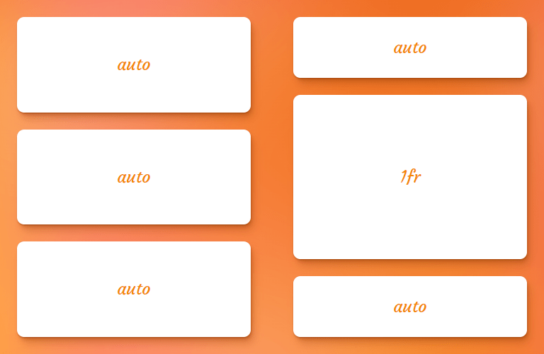
fr unit next to auto tracksmin-content
The min-content keyword represents the smallest amount of space possible that an element can take in a grid container without overflowing its content. The content can be texts, images or videos.
Let’s say the content is “CSS is awesome.” is written in vertical mode, the min-content is the width of the world “awesome” because that is the widest part of the content (wider than “CSS” and “is”). If the row goes any narrower, then the text starts to overflow the container.
In code, that looks like this:
.grid {
  display: grid;
  grid-template-rows: min-content 1fr;
  gap: 1rem;
}

.grid-item {
  writing-mode: vertical-rl;
}
…which results in something like this:
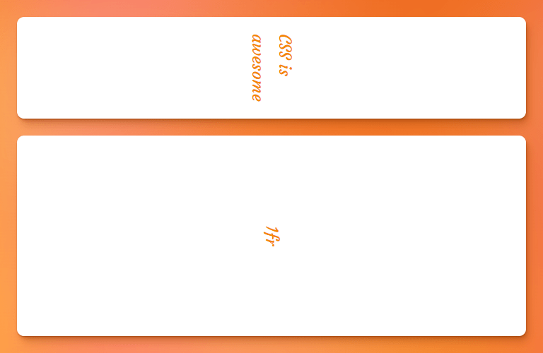
min-content keyword in a grid layoutmax-content
The max-content keyword represents the smallest size required for an element to fit all of its content without being wrapped or overflowed. A name that includes “max”makes it sound like we’re dealing with a maximum size, so this value can be a bit of a brain teaser.
If we revisit our min-content example above, a grid track with a size value of max-content will grow until its content can fit into a single line. So, in the case of “CSS is awesome” the max-content is however much space those three words take up together on one line.
.grid {
  display: grid;
  grid-template-rows: max-content 1fr;
  gap: 1rem;
}
max-content keyword in a grid layoutfit-content( <length-percentage> )
The fit-content() function (there’s a solid explanation of it in our Guide to CSS Functions) uses the space available and accepts a percentage or length value as the maximum size allowed for a grid track while ensuring the track never goes beyond the max-content and never shrinks beyond a minimum. The minimum is often, but not always, equal to the min-content.
.grid {
  display: grid;
  grid-template-rows: fit-content(400px) fit-content(400px) 1fr;
  gap: 1rem;
}
In the figure below, the first row doesn’t expand beyond its max-content size (i.e. the width of the words “fit-content(400px)” on a single line) — it only stretches out to fit its content. The second row, however, has way more content in it, and stops stretching once it gets to a height of 400px, which is the limit set to the function:

400px. If it can fit all the content within that limit, great, stop where the max-content is. Otherwise, show as much you can up to 400px, then start breaking into additional lines.[linename]
While grid lines can always be referred to by implicit numerical name, we can also give them custom names to make the code easier to understand in a more complicated grid. Each line name can then be referenced when positioning grid items by line names.
Grid lines can have more than one name by adding names within square brackets and separating each with a whitespace:
grid-template-rows: [first header-start] 100px [header-end content-start] 1fr [lastline];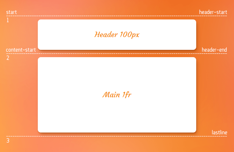
Note that a line name is a <custom-ident>, a generic data type that represents any valid CSS identifier that would not be misinterpreted as a pre-defined keyword in that property’s value definition. So, we can name a line super-awesome-spider-monkey as long as it contains no global CSS values that could cause conflicts, like span, auto, inherit, initial and so on.
Also such identifiers are fully case-sensitive. For example, CSS treats sidebar-end and Sidebar-Name as two completely different, unrelated line names. Also, line names can be explicitly assigned with the grid-template-rows property, or implicitly assigned by named grid areas with the grid-template-areas property.
repeat([ <positive-integer> | auto-fill | auto-fit ] , <track-list>)
The repeat() function is in an efficient way to define the grid-template-rows when the rows are the same. The function takes the number of rows, followed by the row size:
/* Writing this */
grid-template-rows: 1fr 1fr 1fr 1fr 1fr;

/* is the same as this: */
grid-template-rows: repeat(5, 1fr);
Another example, this time from the specification:
grid-template-rows: 10px [row-start] 250px [row-end]
                       10px [row-start] 250px [row-end]
                       10px [row-start] 250px [row-end]
                       10px [row-start] 250px [row-end] 10px;

/* same as above, except easier to write */
grid-template-rows: repeat(4, 10px [row-start] 250px [row-end]) 10px;
auto-fill and auto-fit
Apart from an integer that shows the number of repetitions, two keywords of auto-fill and auto-fit are also allowed to be the first argument of the repeat() function.
These keywords are more suitable for column tracks than row tracks, but let’s see how they behave once applying to the grid-template-rows.
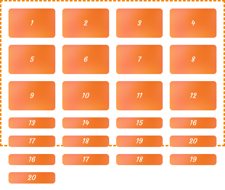
When auto-fill and auto-fit are given as the number of repetitions, and if the grid container has a definite height or maximum height, then the number of repetitions is the largest possible integer that does not cause the grid to overflow the content box of its grid container; if any number of repetitions would overflow, then there’s one repetition.
On the other hand, if the grid container has a definite minimum height, the number of repetitions is the smallest possible integer that fulfills that minimum requirement. Otherwise, the specified track list repeats only once.
As you can see in the following examples, if no explicit height is defined for the grid container, these keywords only apply on the first row track; otherwise they apply to the maximum number of rows that fit to the explicit height and the ones that overflow will have an auto size:

There are a few limitations when using the repeat() function that are worth calling out:
- It is unable to nest a
repeat()function within arepeat()function.
/* This is invalid */
grid-template-rows: repeat(4, 1fr repeat(5, 1fr));- It does not accept intrinsic or flexible length values (e.g.
frunits) when usingauto-fillorauto-fit. It only accepts an explicit track size so it is able to calculate the number of rows that go into the grid container.
/* This is invalid */
grid-template-rows: repeat(auto-fit, 1fr);- It is ok, however, to use and intrinsic or flexible sizing as the function’s second value as long as the first value is a positive number.
/* These are invalid */
grid-template-rows: repeat(auto-fit, 1fr);
grid-template-rows: repeat(min-content, 1fr);

/* This is valid */
grid-template-rows: repeat(6, 1fr);- It can only be used once in the
grid-template-rowstrack list when usingauto-fillorauto-fit. We can use multiplerepeat()functions, however, as long as the second value is fixed.
/* These are invalid */
grid-template-rows: repeat(auto-fill, minmax(10rem, 1fr)) 100px repeat(auto-fill, minmax(5rem, auto));
grid-template-rows: repeat(auto-fill, minmax(10rem, 1fr)) 100px repeat(3, 1fr);

/* This is valid */
grid-template-rows: repeat(auto-fill, minmax(10rem, 1fr)) 100px repeat(3, 200px);
subgrid
Can we have a grid within a grid? Of course we can! That’s thanks to the subgrid keyword value. Declaring this allows the inner (child) grid to share the track lines of the outer (parent) grid, allowing for more consistent track lines without having to re-declare them all over again.
Subgrid is considered experimental and is only supported in Firefox at the time of this writing.
So, say we have a grid within a grid:
.grid-container {
  display: grid;
  grid-template-rows: repeat(4, 1fr);
}
.grid-container .grid-item {
  display: grid;
}
We can turn that nested grid into a subgrid to share the track lines between with the parent grid:
.grid-container {
  display: grid;
  grid-template-rows: repeat(4, 1fr);
  gap: 1rem;
}
.grid-container .grid-item {
  display: grid;
  grid-template-rows: subgrid;
}
Now, the child grid’s items will placed and sized according to the main grid container’s track sizing. For example, consider the following HTML:
<div class="grid">
  <div class="item"></div>

  <div class="item subgrid">
    <div class="subitem"></div>
    <div class="subitem"></div>
  </div>

  <div class="item"></div>
  <div class="item"></div>
</div>
Now let’s make a subgrid:
 .grid {
  display: grid;
  grid-template-columns: repeat(4, 1fr); /* Establish a grid with 4 columns */
  grid-template-rows: repeat(4, 1fr); /* Establish a grid with 4 rows */
}
.item {
  grid-row: 1/-1; /* Make all items as tall as the 4 tracks */
}
.subgrid {
  display: grid;
  grid-template-rows: subgrid;
  grid-row: 3/-1; /* Make the subgrid item size, half of the other items */
}
Here you can see that the subgrid items adjust to the track sizing of the parent grid:
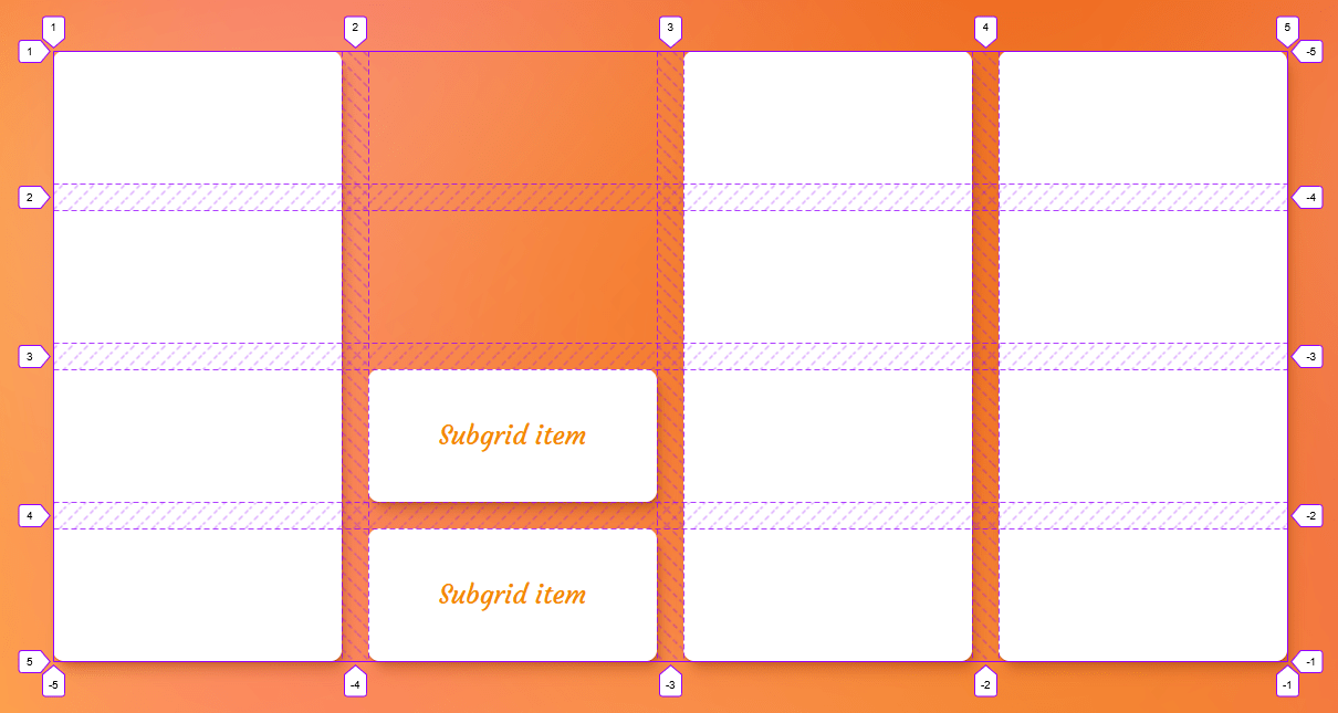
The gaps in a subgrid, are inherited by the parent, but that can be overridden with a different gap value on the subgrid element:
.grid-container {
  display: grid;
  grid-template-columns: repeat(4, 1fr);
  grid-template-rows: repeat(4, 1fr);
  gap: 1rem; /* This is inherited by the child grid */
}
.grid-container .grid-item {
  display: grid;
  grid-template-rows: subgrid;
  gap: 0.5rem; /* This overrides the parent grid's gap */
}
A subgrid has its own line numbers. For instance, when you use line number 1 in your subgrid, it points to the first line of the child grid, not the parent. So, even if a subgrid starts on the third track line of the parent grid, the first track line of the subgrid will still be 1 and not 3.
And, of course, we can declare custom grid line names in a subgrid:
.grid-container .grid-item {
  display: grid;
  grid-template-rows: subgrid [header-start] [header-end] [main-start] [main-last];
}
Oh, and we can totally use the repeat() function here as well to specify track line names:
.grid-container .grid-item {
  display: grid;
  grid-template-columns: repeat(4, 1fr);
  grid-template-rows: subgrid repeat(2, [a] 1fr [b]);
}
One thing to note with that, though, is that the repeat() function merges any track line names that are next to each other.
/* These are equivalent */
grid-template-rows: repeat(2, [a] 1fr [b]);
grid-template-rows: [a] 1fr [b a] 1fr [b];
Note that in a subgrid you cannot have any implicit tracks in that dimension. So, if you add more grid items to the mix, they will be placed in the existing explicit tracks of the subgrid. For instance, adding one more child to the subgrid of the previous example will place that child beneath the last track.
This browser support data is from Caniuse, which has more detail. A number indicates that browser supports the feature at that version and up.
Desktop
| Chrome | Firefox | IE | Edge | Safari |
|---|---|---|---|---|
| 117 | 71 | No | No | 16.0 |
Mobile / Tablet
| Android Chrome | Android Firefox | Android | iOS Safari |
|---|---|---|---|
| No | 115 | No | 16.0 |
masonry
You know what we mean by masonry, right? It’s that cool layout where items in a grid are sort of tiled and pieced together based on the vertical space that’s available in a column. It was popularized years ago by David DeSandro’s JavaScript library of the same name.

Thanks to CSS Grid, masonry is going to be something we can accomplish without resorting to JavaScript. At the time of this writing, however, it’s still quite a way out as part of the Level 3 of the CSS Grid specification, which is currently in Editor’s Draft. It is, however, available in Firefox behind a flag.
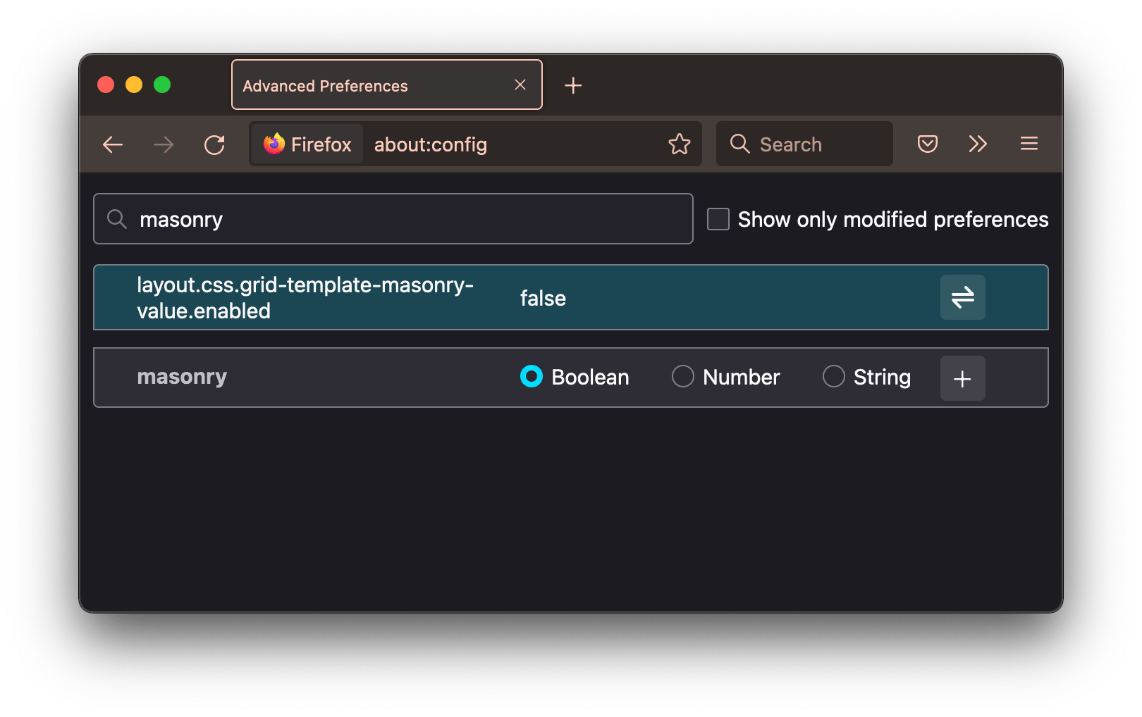
We’re likely to see changes in the specification between now and the time it is actually released. But here’s how it currently looks:
.container {
  display: grid;
  grid-template-columns: repeat(4, 1fr);
  grid-template-rows: masonry;
}
Examples
Yay, demo time! I have a few examples that show off the powers of the grid-template-rows property that you may very well bump into when working with a CSS Grid layout.
App layout
A simple app layout can be achieved with the following CSS:
.layout {
  display: grid;
  grid-template-rows: min-content 1fr min-content;
}Sidebar menu
Masonry
Browser support
More information
- CSS Grid Layout Module Level 2 (introduces
subgrid) - CSS Grid Layout Module Level 3 (introduces the
masonryvalue) - A Complete Guide to CSS Grid (CSS-Tricks)
- The Difference Between Explicit and Implicit Grids (Manuel Matuzovic)
Related tricks!
Counting With CSS Counters and CSS Grid
Breaking Out with CSS Grid Explained
Building a Conference Schedule with CSS Grid
Expandable Sections Within a CSS Grid
Using Position Sticky With CSS Grid
Hexagons and Beyond: Flexible, Responsive Grid Patterns, Sans Media Queries
Related
align-content
.element { align-content: space-around; }
display
.element { display: inline-block; }
gap
.element { gap: 20px 30px; }
grid-template-areas
.element { grid-template-areas: "header header" "sidebar main"; }
grid-template-columns
.element { grid-template-columns: 300px 1fr; }
justify-content
.element { justify-content: center; }
row-gap
.element { row-gap: 2rem; }
