UGURUS offers elite coaching and mentorship for agency owners looking to grow. Start with the free Agency Accelerator today.
The overflow property controls what happens to content that breaks outside of its bounds: imagine a div in which you’ve explicitly set to be 200px wide, but contains an image that is 300px wide. That image will stick out of the div and be visible by default. Whereas if you set the overflow value to hidden, the image will cut off at 200px.
div {
  overflow:  visible | hidden | scroll | auto | inherit
}Values
visible: content is not clipped when it proceeds outside its box. This is the default value of the propertyhidden: overflowing content will be hidden.scroll: similar to hidden except users will be able to scroll through the hidden content.clip: content is clipped when it proceeds outside its box. This can be used withoverflow-clip-marginto set the clipped area.auto: if the content proceeds outside its box then that content will be hidden whilst a scroll bar should be visible for users to read the rest of the content.initial: uses the default value which isvisibleinherit: sets the overflow to the value of its parent element.
Remember that text will naturally wrap at the end of an element (unless white-space is changed) so text will rarely be the cause of overflow. Unless a height is set, text will just push an element taller as well. Overflow comes into play more commonly when explicit widths and heights are set and it would be undesirable for any content to spill out, or when scrolling is explicitly being avoided.
visible
If you don’t set the overflow property at all, the default is visible. So in general, there is no reason to explicitly set this property to visible unless you are overriding it from being set elsewhere.
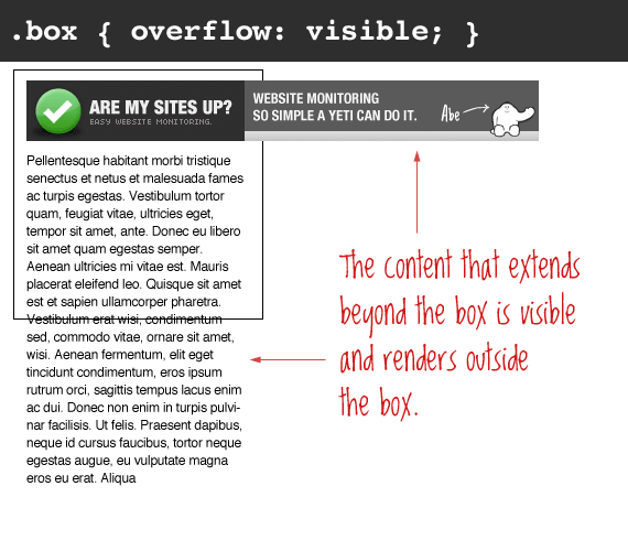
The important thing to remember here is that even though the content is visible outside of the box, that content does not affect the flow of the page. For example:
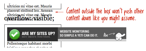
Generally, you shouldn’t be setting static heights on boxes with web text in them anyway, so it shouldn’t come up.
hidden
The opposite of the default visible is hidden. This literally hides any content that extends beyond the box.
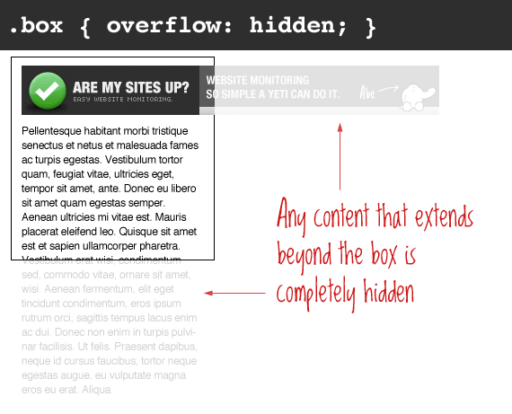
This is particularly useful in use with dynamic content and the possibility of an overflow causing serious layout problems. However, bear in mind that content that is hidden in this way is utterly inaccessible (short of viewing the source). So for example a user has their default font size set larger than you would expect, you may be pushing text outside of a box and hiding it completely from their view.
scroll
Setting the overflow value of a box to scroll will hide the content from rendering outside the box, but will offer scrollbars to scroll the interior of the box to view the content.
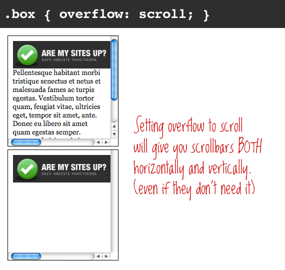
Of note with this value is that you get BOTH horizontal and vertical scrollbars no matter what, even if the content requires only one or the other.
iOS’ momentum scrolling can be enabled for this value with -webkit-overflow-scrolling.
Note: In OS X Lion, when scrollbars are set to only show when being used, scroll behaves more like auto, in that only needed scrollbars will show up.
auto
Auto overflow is very similar to the scroll value, only it solves the problem of getting scrollbars when you don’t need them. The scrollbars will only show up if there is content that actually breaks out of the element.

overflow-x and overflow-y
It’s also possible to manipulate the overflow of content horizontally or vertically with the overflow-x and overflow-y properties. For example in the demo below the horizontal overflow can be scrolled through whilst the text that extends beyond the height of the box is hidden:
.box {
  overflow-y: hidden;
  overflow-x: scroll;
}Clearing floats
One of the more popular uses of setting overflow, strangely enough, is float clearing. Setting overflow doesn’t clear the float at the element, it self-clears. This means that the element with overflow (any value except visible) will extend as large as it needs to encompass child elements inside that are floated (instead of collapsing), assuming that the height isn’t declared. Like this:
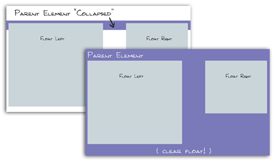
A better float clearing technique is the clearfix, as it doesn’t require you to alter the overflow property in a way you don’t need.
Generating block formatting context
It’s interesting to note that overflow will also create a new block formatting context which is useful if we want to align a block element next to a floated one. In the example below we show how a number of paragraphs will interact with a floated image by default and then we use overflow: hidden to align the text within its own box:
This comes from a great post by Nicole Sullivan which went on to inspire the media object.
Can scrollbars be styled with CSS?
You used to be able to style scrollbars in IE (v5.5?) but no more. You can style them now again in WebKit browsers. If you need cross-browser custom scrollbars, look to JavaScript.
If an element needs to have scrollbars appended to honor the overflow value, Firefox puts them outside the element, keeping the visible width/height as declared. IE puts the scrollbars inside, keeping the overall width/height as declared.
Demo
Demos for this article taken from this sample page.
Browser Support
This browser support data is from Caniuse, which has more detail. A number indicates that browser supports the feature at that version and up.
Desktop
| Chrome | Firefox | IE | Edge | Safari |
|---|---|---|---|---|
| 90 | 81 | 11 | 90 | 16.0 |
Mobile / Tablet
| Android Chrome | Android Firefox | Android | iOS Safari |
|---|---|---|---|
| 115 | 115 | 115 | 16.0 |
More information
- Understanding the Humble Clearfix
- Overflow: a secret benefit
- Overflow on MDN
- Overflow on W3C
- Finding/fixing unintended body overflow

Good stuff… but I want to mention “overflow-x” and “overflow-y” CSS properties. These come in handy sometimes!
Really helpful, Thank you :D
Hi, in android os, overflow: scroll; -webkit-overflow-scrolling: touch; not supported
Hello, I appreciate your effort! But I have been dealing with a problem. I have a five set of images in slideshow inside a div element and the layout of the webpage is properly fluid. Using overflow on the div element either adds scrollbars to the div element or cuts the image (which looks very awkward). Please suggest me something so that the image doesn’t overflow.
use overflow-x:hidden; this is more good
OMG, I wanna have your baby. I’ve been farting with this no scrollbar problem in IE9 for four hours now and your solution to take out overflow: visible and let the browser default to the scroll bars was positively bril. Thank you!
That is the big “stretch” these con artists are selling.
Chris,
Any idea if this is possible when the container element does not have a fixed width? In other words, where the wrapper is not explicitly set but is instead defined by the page wrapper or body? (In other words, ‘100%’)
I want to create a scrollable subnavigation that can have a width as large as the viewport of a mobile device and may adapt depending on screen orientation.
I should clarify that it is to be scrollable along the x-axis only.
Was there a response to this question? I have the same requirement. Thanks, Bill. The question was “..is possible when the container element does not have a fixed width? In other words, where the wrapper is not explicitly set but is instead defined by the page wrapper or body? (In other words, ‘100%’)”
This is doubtlessly too late, but I sure would have appreciated an answer to this thread last week, so here’s what I figured out.
I was never able to get it working with
100%width in its containing element, but things went pretty easy once I switched tovwunits (a unit that is 1% the size of the viewport). If you’re aiming to do the full width of the viewport anyway,100vwis a fine alternative to100%.In my specific case, I actually wanted a horizontal scrollable to be placed next to a fixed-width column. Since using
100%kept giving me trouble, I put acalc()in to subtract out the column’s width from the total viewport:calc(100vw - 470px).I needed to use
overflow-x: hiddenandoverflow-y: autoto remove the scrollbars in Chrome Android and unfortunately it also removes momentum scroll in Safari iOs. I add -webkit-overflow-scrolling: touch and Safari iOs get momentum scroll back. It’s so great, it saved me hours and hours, thank you Chris !nice artical…..
In the first case where I don’t want the image to stick out of the div and be visible The overflow: hidden doesn’t work for safari. Do you know a work around it? I read that safari has a bug with position and overflow. I took out position complete still it gives me the same issue can you please suggest any work around that you may have for Safari
example code:
Is there any idea how to make a position fixed object able to scroll within its container inside mobile?
NOTE: you cannot use overflow:auto or overflow:scroll on a
<fieldset>tag, in Firefox at least. The same likely applies in other browsers. Stick your overflow CSS on a<div>instead.My experience is that you can but why would you want to… The point of a fieldset I would think is to use in conjuration with a legend at which point if you did scroll your legend will be overlapping onto your text and looking bad. I agree with you that using overflow options in that scenario should be used on a div within the fieldset, and if you are not going to use a legend then use a div with a border instead of a fieldset.
Yeah, it wouldn’t necessarily be a good idea in the first place. I just wanted to document this here, as it took a bit of head scratching to figure out what was going on, and I didn’t want others to make the same mistake.
Of course, similar things can happen for
<td>tags… i.e. there are some style rules that don’t work on certain tags (at all, or as expected, or behave differently in different browsers), in which case wrapping a<div>on the inside and styling it instead, is often the easiest solution.Much informative.. I will surely appreciate the simple language explanation of complex techie stuff..
Isnt there a way in which the image from the example above scales down perfectly in size to fit the specified width of the container, just as the case of a responsive image sort of, with any part of it been cut off.
If it is a background image you can set the size to contain
… and if its an element, simply use the max-width: 100%; declaration.
Great!!! IT helped me..
Thanks for writing this!
Quick question, I’m using static heights and widths to make big clickable boxes on a responsive design. I set the properties to relative positioning with overflow hidden so that they align well, but in safari overflow hidden doesn’t work. Any ideas on making it work?
Meanwhile I’ll be using the clear fix you recommended and floating the elements. Thanks!
To remove the horizontal scrollbars when you don’t need them, I think you can do
overflow-y: scroll; overflow-x: hidden;It leaves the vertical scrollbars while taking out the horizontal ones
How to change the scrollbars color?
how to make scrollbars visible both on android as well as ios…
awesome
Great article! I’m currently experiencing some troubles on Android 4.4.2 (Samsung Tab) where I cannot get the overflow containers to scroll. Your demo works fine on the same device. On my phone (Android) and other test-devices (iPhone, iPad) it works just fine.
Does anybody know of a current Android ‘overflow: scroll’ or ‘overflow: auto’ problem? Or does anyone have the same issues.
Can’t provide the dev code, but I think all the relevant css is there:
Any help would be great!
Hi, i have problem with overflow-x:hidden and overflow-y:visible. Here is example:https://jsfiddle.net/31mkqbwp/2/ why when I set overflow-x:hidden on #container, overflow-y:visible is not working and there is always vertical scrollbar?
Hello, I am trying to add multiple select in a div which is having a overflow:scroll but the drop down is within the div it has to appear outside the div. Can you please suggest me how to solve the issue.
https://jsfiddle.net/irshadmb/a3z5ccax/
Overflow tag not working?!
I want to create the whole div element of 200 by 200 like this:
http://weedbeats.com/resident-djs/
When you hover over artist’s images…
HTML CODE:
”’
Hello
200X200
”’
CSS CODE:
”’#a
{
width: 200px;
height: 200px;
overflow: hidden;
background-color: #cc4400;
}
#b
{
position: absolute;
height: 100px;
width: 200px;
padding: 0;
margin: 0;
transform: translatey(200px);
background-color: #404040;
transition-property: all;
transition-duration: 1s;
}
#c
{
position: absolute;
width: inherit;
height: inherit;
margin: 0;
}
#a:hover > #b
{
transform: translatey(100px);
background-color: 606060;
}”’
HTML CODE:
Hello
200X200
https://wdtime.ru/css/overflow-css-perepolnenie-elementa
IOS safari scrolls not working. Here is the code below. Anybody knows what’s the problem.
Hey there , Thanks for this article but I wanna know how to visible overflow only for one side of an element, like only for top or left.
thanks a lot. very explanatory. i used it a couple times but couldnt get an explicit explantion. thanks once again