UGURUS offers elite coaching and mentorship for agency owners looking to grow. Start with the free Agency Accelerator today.
The mask-type CSS property indicates whether the SVG <mask> element is treated as an alpha mask or a luminance mask.
mask {
  mask-type: alpha;
}
When the mask layer is an image or a gradient, a mask-mode property can be set on the HTML element to specify the type of masking. However, if an SVG <mask> element is used as the mask layer, the mask-type can be set on the <mask> element itself. The mask-mode property can override this preference.
Syntax
mask-type: alpha | luminanceThe property accepts one keyword value of the alpha and luminance values.
- Initial value:
luminance - Applies to:
<mask>elements - Inherited: no
- Computed value: absolute length
- Animation type: discrete
Values
/* Keyword values */
mask-type: alpha;
mask-type: luminance;

/* Global values */
mask-type: inherit;
mask-type: initial;
mask-type: unset;luminance: The default value. The luminance values of the mask are used for the mask values.alpha: The alpha values (alpha channel) of the mask are used for the mask values.initial: Applies the property’s default value,luminance.inherit: Adopts themask-typevalue of the parent.unset: Removes the currentmask-typefrom the element.
Alpha and luminance masks
Alpha? Luminance? It’s worth visiting these terms as they relate to CSS masking.
Alpha masks
Images are made of pixels, where each pixel contains color values. And some color values contain an alpha channel to set transparency on the color. An image with an alpha channel can be an alpha mask, like PNG images with transparent areas.
In a simple masking operation, we have an element and a mask image placed on top of it. The alpha value of each pixel in the mask image will be merged with its corresponding pixel in the element.
- If the alpha value is zero (i.e. transparent), it wins out and that part of the element is masked (i.e. hidden).
- An alpha value of one (i.e. fully opaque) displays those pixels.
- An alpha value between 0 and 1 (e.g. 0.5) allows the pixel to be visible, but with a certain level of transparency.
Bottom line, the mask value at a given point is the value of the alpha channel at that point of the mask image. If that point is fully transparent (i.e. alpha value of 0), then it won’t display. The reverse is true with a fully opaque (i.e. alpha value of 1), where that point is fully displayed.
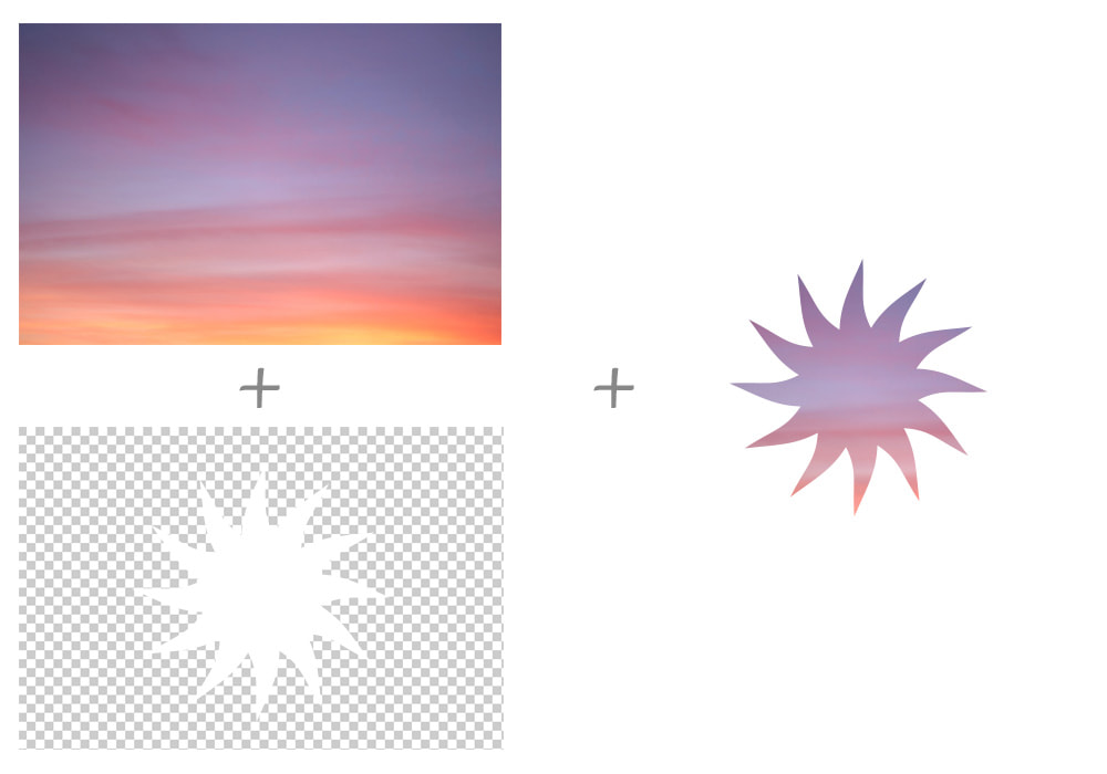
The example bellow is an alpha mask that only contains black (i.e. alpha value of 1) and transparent areas (i.e. alpha value of 0).

Luminance masks
In a luminance mask, colors and alpha values matter. When the alpha value is 0 (i.e. fully transparent), the element is hidden. The mask values vary depending on the color channel of that pixel when the alpha value is 1. For example, when the color is white, the element is visible; in the case of black area, the element is hidden.
We saw that calculating mask values in an alpha mask is based only on the alpha values of the mask image. On the flip side, the mask values of a luminance mask are computed from both the luminance and alpha values. Here’s how the browser responds:
- First, it computes a luminance value from the color channel values.
- Then, it multiplies that computed luminance value by the corresponding alpha value to produce the mask value.
Check out the CSS Masking Module 1 specification from the September 2019 Editor’s Draft for more information.
Below is the same exact example we saw for alpha masks, but with a difference: This time, we have a fully opaque white area in the center (instead of black) surrounded by transparent areas around it. As you can see, the white area is fully visible just as it was with the black alpha mask:

Example
The following example is using a mask element with black and transparent areas:
<div>Put a nice mask on me!</div>
<svg>
  <mask id="mask">
    <path fill="black" d="M10,35 A20,20,0,0,1,50,35 A20,20,0,0,1,90,35 Q90,65,50,95 Q10,65,10,35 Z" />
  </mask>
</svg>
Using the element’s ID (#mask), we can place the mask on the <div> element.
div {
  width: 100px;
  height: 100px;
  background-color: #134;
  mask-image: url(#mask);
}
Since this mask has black and transparent areas, we set mask-type to alpha:
mask {
  mask-type: alpha;
}
If the path element had white areas, the default value, luminance, would work perfectly fine here instead.
This example only works in Firefox at the time of writing.
Browser support
| IE | Edge | Firefox | Chrome | Safari | Opera |
|---|---|---|---|---|---|
| No | 79+ | 35+ | 24+ | 6.1+ | 15+ |
| Android Chrome | Android Firefox | Android Browser | iOS Safari | Opera Mobile |
|---|---|---|---|---|
| Yes | Yes | 81+ | 7+ | 59+ |
More information
Related properties
mask-clip
.element { mask-clip: padding-box; }
mask-image
.element { mask-image: url(star.svg); }
mask-mode
.element { mask-mode: alpha; }
mask-origin
.element { mask-origin: content-box; }
mask-position
.element { mask-position: 20px center; }
mask-repeat
.element { mask-repeat: repeat-y; }
mask-size
.element { mask-size: 200px 100px; }
