UGURUS offers elite coaching and mentorship for agency owners looking to grow. Start with the free Agency Accelerator today.
The grid-auto-rows CSS property is part of the CSS Grid Layout specification, specifying the size of the grid rows that were created without having an explicit size. In other words, this property sets the size of implicit rows and any other rows that have not been explicitly sized in the grid-template-rows property.
.grid-container {
  display: grid;
  grid-template-areas: "media detail detail"
                       "media detail detail";
  grid-template-rows: 200px;
  grid-auto-rows: 150px;
}
That example creates a grid container with two rows defined by grid-template-areas. The first row has an explicit size set by grid-template-rows, but not the second row. This is where grid-auto-rows kicks in and sets that row’s size to 150px.
grid-auto-rows use cases
As said above, grid-auto-rows sets the size of any rows that don’t have an explicit size. Now the question is, what kind of rows don’t have an explicit size? Or, how does a grid create rows without an explicit size?
Here are some situations where that might come up.
Rows that are defined by grid-template-areas that have no explicit size set by grid-template-rows
The first case is the one that we saw at the top of this article. A grid can have an explicit row defined by grid-template-areas without having its size set explicitly by the grid-template-rows property.
.grid-container {
  display: grid;
  grid-template-areas: "media detail detail"
                       "media detail detail"; /* 2 rows */
  grid-template-rows: 200px; /* 1 size */
}
The first row is set to 200px, and since the last row is not set to any explicit size, it will be set to auto. In this example the second row does not have any content therefore auto is equal to zero size.
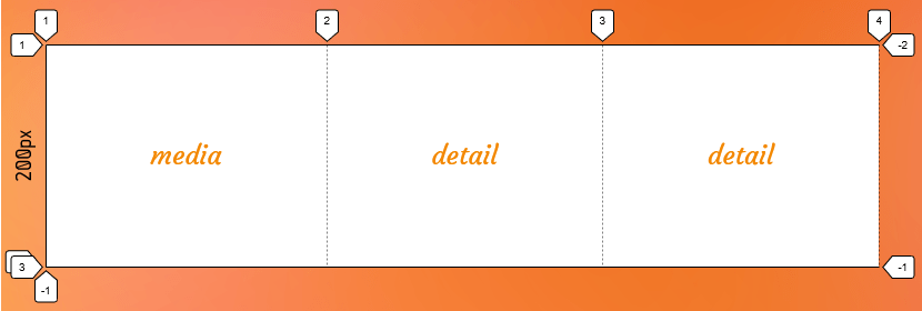
If we add the grid-auto-rows to the above example we can control the size of the last row too:
.grid-container {
  display: grid;
  grid-template-areas: "media detail detail"
                       "media detail detail";
  grid-template-rows: 200px;
  grid-auto-rows: 150px;
}

/* Make sure grid items expand to the second row */
.grid-items {
  grid-row: 1/3;
}
Now as you can see in the following image, the last row’s size is set to 150px:
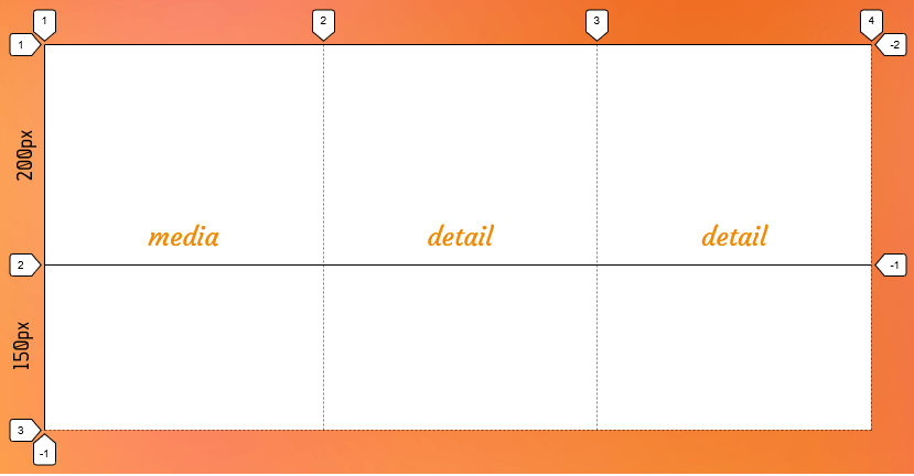
Note that the tracks that don’t have an explicit size are auto-sized.
Implicit rows are created when there are more grid items than cells
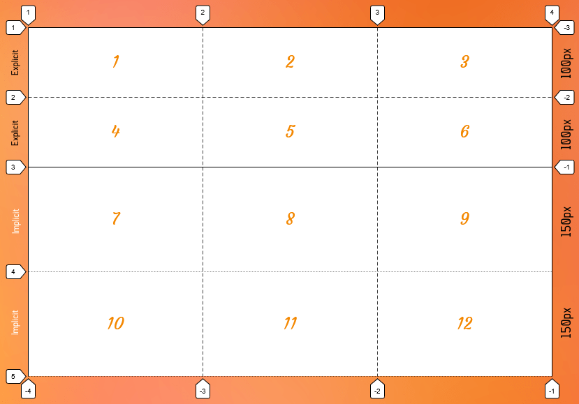
A grid that is defined by the grid-template-columns, grid-template-rows or/and grid-template-areas is called an explicit grid, meaning that all the grid tracks are a set size. Let’s say, for example, we have six HTML child elements in a parent grid container, and we explicitly define three columns and two rows in the grid.
.grid {
  display: grid;
  grid-template-columns: repeat(3, 1fr);
  grid-template-rows: repeat(2, 100px);
}
We have implicit grid tracks for those columns and rows because there’s no sizing information. Only the number of columns and the number of rows.
One situation where you’ll find implicit rows is when there are more grid items than there are defined rows. Imagine in our last example that we now have more than 6 HTML elements. We previously set up three columns and two rows, so there are exactly 6 cells in the grid — the perfect amount for our 6 elements. But with more than 6 elements, we suddenly have an overflow problem, right?
Not at all! CSS Grid’s auto-placement algorithm creates additional rows or columns to hold the extra items. Those extra columns and rows are called implicit tracks.
By default, the auto-placement algorithm creates row tracks to hold extra items, so our grid is capable of holding everything, no matter how many items we toss at it.
However, the implicit rows are sized automatically based on their content. That’s why grid-auto-rows is so useful —we can give all of those rows a size and CSS Grid will stop filling rows when it reaches the last element.
Say we size those implicit grid rows to 150px:
.grid-container {
  display: grid;
  grid-template-columns: repeat(3, 1fr);
  grid-template-rows: repeat(2, 100px);
  grid-auto-rows: 150px;
}
Now, no matter how many implicit rows get created, they will all have their size set to 150px.
Implicit rows are created when we position an item outside of the explicit grid
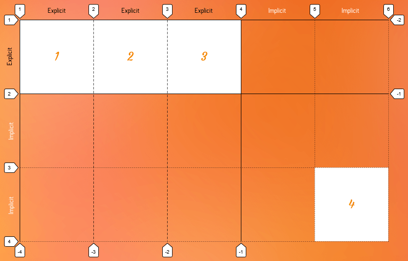
Another scenario where the grid-auto-rows property comes in handy is when implicit tracks are created when we position an item outside of the explicit grid. The implicit tracks are automatically created to make a place for that item.
.grid-container {
  display: grid;
  grid-template-columns: 150px 150px 150px; /* 3 explicit columns */
  grid-template-rows: 150px; /* 1 explicit row */
  grid-auto-rows: 150px; /* Size of the implicit rows */
}

.grid-item:last-child {
  grid-column: 5;
  grid-row: 3; /* Placed in 3rd row in a 1-row grid */
}
So what we did there was set the last .grid-item child in the third row… but there is no third row in our one-row grid! That puts the last grid item outside the explicit grid, which creates two implicit row tracks. Even though those rows were created for us, we can set them to 150px using the grid-auto-rows property.
150px using the grid-auto-rows property.Syntax
grid-auto-rows: <track-size>+Full definition
where
<track-size> = <track-breadth> | minmax( <inflexible-breadth> , <track-breadth> ) | fit-content( [ <length> | <percentage> ] )

where
<track-breadth> = <length-percentage> | <flex> | min-content | max-content | auto <inflexible-breadth> = <length> | <percentage> | min-content | max-content | auto

where
<length-percentage> = <length> | <percentage>- Initial value:
auto - Applies to: grid containers
- Inherited: no
- Computed value: as specified, but with relative lengths converted into absolute lengths
- Percentages: refer to corresponding dimension of the content area
- Animation type: if the list lengths match, by computed value type per item in the computed track list; discrete otherwise
Multiple track sizes
We can specify multiple row sizes for grid tracks using the grid-auto-rows property. In this case, the multiple track size works as a pattern and it gets repeated if necessary.
.grid-container {
  display: grid;
  grid-template-rows: 50px 50px;
  grid-auto-rows: 40px 60px 80px;
}

.grid-item:last-child {
  grid-row: 8;
}
Here, we move the last child of our grid out of the explicit rows and our grid creates implicit rows to hold that item as a result. This grid has two explicit rows (50px 50px) and since the last item wants to be in the eighth row (grid-row: 8), six implicit rows are automatically generated in the grid.
The grid-auto-rows sets the first implicit row size to 40px, the second to 60px and third row to 80px. Since we have more than three implicit rows, our grid repeats this pattern to size them.
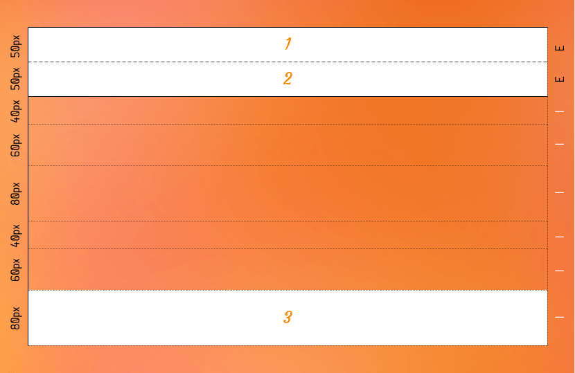
grid-auto-rows property. The multiple values get repeated as the size of the implicit rows.If we had one more implicit rows, what would be the size of that row?
Show me the answer!
Correct, it would be 40 pixels tall!
Values
The grid-auto-rows values are almost the same as the values of the grid-template-rows property, except in grid-auto-rows you can’t use the following values:
none[linename]repeat()subgridmasonry
/* Keyword values */
grid-auto-rows: auto;
grid-auto-rows: min-content;
grid-auto-rows: max-content;

/* single track-size values */
grid-auto-rows: 200px;
grid-auto-rows: 30vmin;
grid-auto-rows: 50%;
grid-auto-rows: 1.5fr;
grid-auto-rows: minmax(100px, 2fr);
grid-auto-rows: minmax(min-content, 1fr);
grid-auto-rows: fit-content(15rem);

/* multiple track-size values */
grid-auto-rows: 100px 1fr;
grid-auto-rows: 200px min-content 1fr;
grid-auto-rows: 100px 200px 50px 10%;
grid-auto-rows: minmax(100px, auto) auto max-content fit-content(200px);

/* Global values */
grid-auto-rows: inherit;
grid-auto-rows: initial; /* same as `auto` */
grid-auto-rows: revert;
grid-auto-rows: revert-layer;
grid-auto-rows: unset;
<length>
This value can be any valid and non-negative CSS length, such as px, em and rem, among others to specify the track size (i.e. height) of the row.
<percentage>
This is a non-negative value relative to the inner inline size of the grid container. If the size of the grid container depends on the size of its tracks, then the percentage must be treated the same as declaring auto.
One disadvantage of using a percentage value is that, if you add gaps between the tracks, the size of the gaps will be added to the size of the tracks which may cause an overflow. Use the fr unit or auto keyword to size the tracks and prevent that from happening.
<flex>
This is a non-negative value expressed in fr units and it allows you to create flexible grid tracks by specifying the size of a track as a fraction of the available space in the grid container. That way, as the grid changes heights, so do the rows, making for a more responsive grid.
For example, consider a grid container that’s 900px tall and it has three implicit rows. Let’s say the height of the first (top) row is fixed (i.e. it doesn’t change) at 300px while the second row takes up one fractional unit (1fr) and the third row weighs in at two fractional units (2fr):
.grid {
  display: grid;
  height: 900px;
  grid-auto-rows: 300px 1fr 2fr;
}
The second two rows are fractional, so they’re going to take any remaining available space. And, in this case, the available space is whatever is leftover after the first row’s fixed 300px height is taken into account. After that, the second two rows divvy up what’s left according to how many fractions they get.
In this example, the remaining and available space is 600px (i.e. 900px minus 300px). The second rows gets one fraction (1fr) of that space and the third row gets two fractions (2fr). Let’s get math-y for a moment to figure out the height of one fraction of 600px:
1fr = ([Grid Container Height] - [Fixed Row Height]) / [Sum of the flex factors]
1fr = (900px - 300px) / 3
1fr = 600px / 3
1fr = 200px
Aha! One fraction is 200px. And since the second row is 1fr, it must be 200px as well. That leaves us with 400px of available space (900px – 300px – 200px) which just so happens to be twice the size of the second row.
minmax(min, max)
The minmax() function accepts two arguments: a minimum length value and a maximum length value. And what that tells a grid container is that the grid-auto-rows can be no taller than the minimum value, but no shorter than the maximum value. Our Guide to CSS Functions has a more thorough, detailed explanation of how the function works.
Take the following example:
grid-auto-rows: 200px minmax(100px, 400px);There are two rows here: one that’s 200px tall, and another that’s expressed as minmax(100px, 400px). Looks weird, right? But all that’s saying is that the second row must take up at least 100px of space, but no more than 400px.
In clearer terms: As long as there’s more than 100px of available space, then the second row can flex up to 400px but has to stop there. Otherwise, the row is 100px tall.
The min and max arguments accept all the following values, except that the min value can’t be a flex value (e.g. 1fr):
<length-percentage> | <flex> | min-content | max-content | autoSo, this is invalid since the min value is a flex value:
/* 👎 */
grid-auto-rows: minmax(1fr, 500px) 3fr;
But these are totally valid:
/* 👍 */
grid-auto-rows: minmax(auto, 1fr) 3fr;
grid-auto-rows: minmax(200%, 1fr) 1fr;
auto
The auto keyword behaves similarly to minmax(min-content, max-content) in most cases.
Since auto track sizes can be stretched by the align-content and justify-content properties, they will take up any remaining space in the grid container by default auto-matically. That said, auto track sizes can’t win a fight against fr units when allocating the remaining space — they adjust to the maximum size of their content.
Take a look at the result of these two track examples:
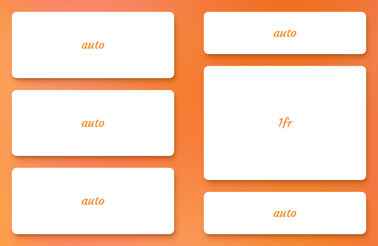
grid-auto-rows: auto auto auto;
grid-auto-rows: auto 1fr auto;
When all three rows are set to auto, all they do is share equal space. But when we drop a fractional unit in the middle as the second row, the auto rows are only as tall as the content inside them and the 1fr row takes up the remaining space.
min-content
The min-content keyword represents the smallest amount of space possible that an element can take in a grid container without overflowing its content. The content can be texts, images or videos.
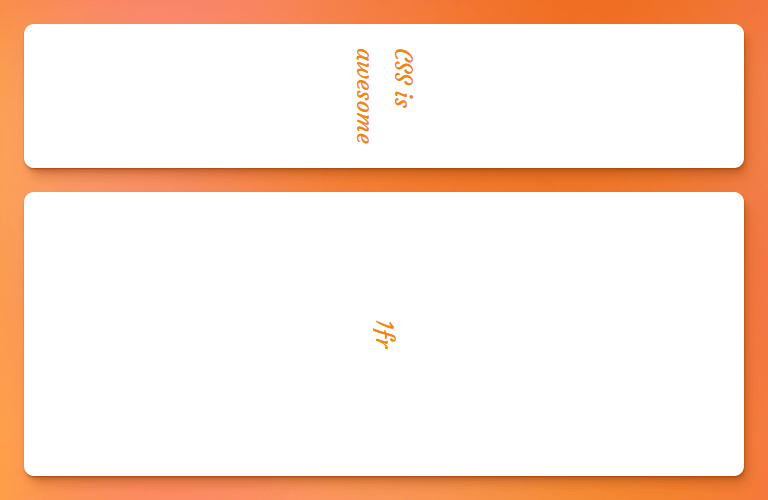
Let’s say the content is “CSS is awesome.” written in vertical mode, the min-content is the width of the world “awesome” because that is the tallest part of the content (taller than “CSS” and “is”). If the row goes any shorter, then the text starts to overflow the container.
In code, that looks like this:
.grid {
  display: grid;
  grid-auto-rows: min-content 1fr;
  gap: 1rem;
}

.grid-item {
  writing-mode: vertical-rl;
}
…which results in something like this:
max-content
The max-content keyword represents the smallest size required for an element to fit all of its content without being wrapped or overflowed. A name that includes “max”makes it sound like we’re dealing with a maximum size, so this value can be a bit of a brain teaser.
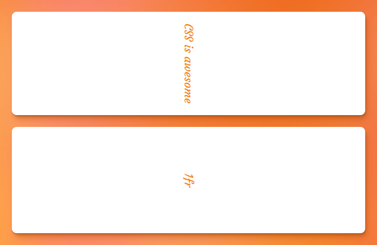
If we revisit our min-content example above, a grid track with a size value of max-content will grow until its content can fit into a single line. So, in the case of “CSS is awesome” the max-content is however much space those three words take up together on one line.
.grid {
  display: grid;
  grid-auto-rows: max-content 1fr;
  gap: 1rem;
}
fit-content(<length-percentage>)
The fit-content() function (there’s a solid explanation of it in our Guide to CSS Functions) uses the space available and accepts a percentage or length value as the maximum size allowed for a grid track while ensuring the track never goes beyond the **max-content** and never shrinks beyond a minimum. The minimum is often, but not always, equal to the min-content.
.grid {
  display: grid;
  grid-auto-rows: fit-content(400px) fit-content(400px) 1fr;
  gap: 1rem;
}
In the figure below, the first row doesn’t expand beyond its max-content size (i.e. the width of the words “fit-content(400px)” on a single line) — it only stretches out to fit its content. The second row, however, has way more content in it, and stops stretching once it gets to a height of 400px, which is the limit set to the function:

400px. If it can fit all the content within that limit, great, stop where the max-content is. Otherwise, show as much you can up to 400px, then start breaking into additional lines.Examples
Let’s create a gallery with an unknown number of items that get auto-repeated in rows and since we don’t know how many items we’re gonna have, there is no way for us to know how many rows are going to be needed therefore, no way to set the size of the rows explicitly.
This is where the grid-auto-rows property comes in handy to set the size of those auto-generated rows in our gallery.
We want our rows to have a pattern of 150px and 200px size repeated:
.gallery {
  display: grid;
  grid-template-columns: repeat(auto-fit, minmax(300px, 1fr));
  grid-auto-rows: 150px 200px;
  gap: 1rem;
}
In the following demo you can add more items and see the effect of grid-auto-rows:
Browser support
More information
A Complete Guide to CSS Grid
The Difference Between Explicit and Implicit Grids
Another Collection of Interesting Facts About CSS Grid
Understanding the difference between grid-template and grid-auto
IE10-Compatible Grid Auto-Placement with Flexbox
Auto-Sizing Columns in CSS Grid: `auto-fill` vs `auto-fit`
Look Ma, No Media Queries! Responsive Layouts Using CSS Grid
Related
display
.element { display: inline-block; }
gap
.element { gap: 20px 30px; }
grid-auto-columns
.element { grid-auto-columns: minmax(100px, 200px); }
grid-template
.element { grid-template: 100px 1fr / 300px 1fr; }
grid-template-areas
.element { grid-template-areas: "header header" "sidebar main"; }
grid-template-columns
.element { grid-template-columns: 300px 1fr; }
grid-template-rows
.element { grid-template-rows: minmax(auto, 1fr) 3fr; }
