UGURUS offers elite coaching and mentorship for agency owners looking to grow. Start with the free Agency Accelerator today.
The outline-color CSS property specifies the color of an element’s outline. What’s an outline? An outline is a line that is drawn around elements — outside the border edge — that is used for accessibility or decoration purposes when that element is in focus.
button {
  outline-color: #e435;
}
outline-color is a constituent property in the outline shorthand and is defined in the CSS Basic User Interface Module Level 4 specification which is currently in Editor’s Draft status.
Usage
We usually set the outline of an element using the shorthand property:
a:focus {
  outline: 0.1em solid darkgray;
}
Syntax
outline-color: <color>| invert- Initial value:
invert(currentColor, in caseinvertis not supported) - Applies to: all elements
- Inherited: no
- Computed value: For the keyword
invert, the computed value isinvert. For the color value, if the value is translucent, the computed value will be thergba()corresponding one. If it isn’t, it will be thergb()corresponding one. The transparent keyword maps torgba(0,0,0,0). - Animation type: discrete
Values
/* Keyword value */
outline-color: invert;

/* <color> values */
outline-color: #333;
outline-color: darkorange;
outline-color: hsl(210,100%,44%);

/* Global values */
outline-width: initial;
outline-width: inherit;
outline-width: unset;<color>: Defines the color of the outline and accepts<rgb()>,<rgba()>,<hsl()>,<hsla()>,<hex-color>,<named-color>,currentcolorand<deprecated-system-color>invert: The default value. Specifies an inverted value of the background color of where the outline is rendered, therefore it ensures that the outline is visible.initial: Applies the property’s default setting, which isinvert.inherit: Adopts theoutline-colorvalue of the parent.unset: Removes the currentoutline-colorfrom the element.
According to specs, If the browser doesn’t support the invert value, then the initial value of the outline-color property is the currentColor keyword, but at the time of writing, invert is considered invalid in all modern browsers. You can check the browser support at caniuse.
Example
The following example makes the outline of the button red once it’s focused:
button {
  outline-width: 1px;
  outline-style: solid;
  outline-color: gray;
}

button:focus {
  outline-color: red;
}
Accessibility
An outline is typically used to indicate focus on elements, which can be useful for non-mouse interactions for accessibility reasons and it can generally benefit all users.
It’s very likely that you would want to change the outline color to match your brand or to make it more noticeable. And this is when outline-color comes in handy. But make sure your custom color meet WCAG’s requirements, particularly Success Criterion 2.4.7 which details a visible focus state.
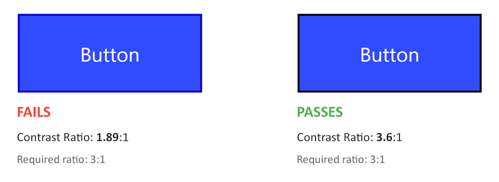
Not only we need to ensure that the contrast ratio between the outline color and the background it’s on is high enough to ensure clear visibility, but also in cases where there is no space between the outline and the element — then we need to check the contrast ratio between the outline color and the background of the element itself.
Non-text UI controls, like buttons, must have a color contrast ratio of at least 3:1 against adjacent colors, according to WCAG Success Criterion 1.4.3.

Sara Soueidan explains this very well in her “A guide to designing accessible, WCAG-compliant focus indicators” article. You can learn a lot more about WCAG’s contrast ratios and how they’re determined in Stacy Arellano’s deep dive article.
Demo
Play with outline properties in the following demo:
Browser support
| IE | Edge | Firefox | Chrome | Safari | Opera |
|---|---|---|---|---|---|
| 8+ | All | All | All | All | All |
| Android Chrome | Android Firefox | Android Browser | iOS Safari | Opera Mobile |
|---|---|---|---|---|
| All | All | 92+ | All | 64+ |
