UGURUS offers elite coaching and mentorship for agency owners looking to grow. Start with the free Agency Accelerator today.
The background-size property in CSS is one of the most useful — and most complex — of the background properties. There are many variations and different syntaxes you can use for this property, all of which have different use cases. Here’s a basic example:
html {
  background: url(greatimage.jpg);
  background-size: 300px 100px;
}
That’s an example of the two-value syntax for background size. There are four different syntaxes you can use with this property: the keyword syntax, the one-value syntax, the two-value syntax, and the multiple background syntax.
Keywords
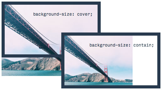
In addition to the default value (auto), there are two keywords you can use with background-size: cover and contain

cover tells the browser to make sure the image always covers the entire container, even if it has to stretch the image or cut a little bit off one of the edges. contain, on the other hand, says to always show the whole image, even if that leaves a little space to the sides or bottom.
The default keyword — auto — tells the browser to automatically calculate the size based on the actual size of the image and the aspect ratio.
One value
If you only provide one value (e.g. background-size: 400px) it counts for the width, and the height is set to auto. You can use any CSS size units you like, including pixels, percentages, ems, viewport units, etc.
Two values
If you provide two values, the first sets the background image’s width and the second sets the height. Like the single value syntax, you can use whatever measurement units you like.
Multiple images
You can also combine any of the above methods and apply them to multiple images, simply by adding commas between each syntax. Example:
html {
  background: url(greatimage.jpg), url(wonderfulimage.jpg);
  background-size: 300px 100px, cover;
  /* first image is 300x100, second image covers the whole area */
}
Keep background image stacking order in mind when using multiple images.
Demo
This demo shows examples of cover, contain, and multiple background images with a mix of pixel and keyword values.
Browser support
| IE | Edge | Chrome | Firefox | Safari | Opera |
|---|---|---|---|---|---|
| 9+ | All | All | 3.6+ | All | All |
| iOS Safari | Chrome Android | Firefox Android | Android Browser | Opera Mobile |
|---|---|---|---|---|
| All | All | All | 90+ | All |
More information
A Quick Overview of `object-fit` and `object-position`
Perfect Full Page Background Image
Optimizing for Large-Scale Displays
Creative Background Patterns Using Gradients, CSS Shapes, and Even Emojis
More Control Over CSS Borders With background-image
Related properties
background
.element { background: url(texture.svg) top center / 200px 200px no-repeat fixed #f8a100; }
background-attachment
.hero { background-attachment: fixed; }
background-blend-mode
.element { background-blend-mode: screen; }
background-clip
.element { background-clip: padding-box; }
background-image
.element { background: url(texture.svg); }
background-origin
.element { background-origin: border-box; }
background-position
.element { background-position: 100px 5px; }
background-repeat
.element { background-repeat: repeat-x; }

really helpful.
Very great article
thank you
thats cool, but if you want a carousel to maintain the entire image as the page responds from computer down to phone how do you do that?
When using the ‘cover’ property, how can keep the image centered even when scaling down for responsive?
Just use background-position to center the background image. Like the following to center it horizontally in the top (if that’s what you need):
background-size: cover;background-position: center 0;
I’m using an SVG sprite that is getting continually added to (ie, the dimensions continue to change) throughout development. For this reason I don’t want to specify two value for background-size.
It looks like (surprise!) IE (Edge and 10) doesn’t understand the single value option.
How would you suggest I handle this problem?
Nevermind. I think I figured it out!
I make my SVG sprite a single column. Luckily all my icons are the same width, so this is one icon’s width wide: 40px.
I set css background-size to 100%, which works for IE.
The sprite fits the width of the containing element (extra height is hidden), and adjusts based on that element’s width.
The height of the sprite can continue to grow as the project rolls forward, as long as I never change the width and only add new icons to the bottom.
I control the background-position using only the vertical property. Horizontal is always zero.
Voila!
Want a smaller (20px wide) icon? Change width of containing element to 20px wide and cut the vertical position shift in half to change icons.
Using both cover and contain distorts the dimensions of my background image. Is there a way to make it so that when the image is resized to fit the div, the dimensions are constrained to their original ratio and any overlap is hidden outside the div? That way my image is not distorted but rather cut off at the sides.
My man you don’t know how much time I’ve been spending trying to find a proper solution on “How to make an image fit inside a container”.. you guys are awesome. Sad part is there’s tons of tutorials the experts the guru’s making contents after contents but they all forgets small things that could save our precious time.. You guys are solid….Big Fan.