UGURUS offers elite coaching and mentorship for agency owners looking to grow. Start with the free Agency Accelerator today.
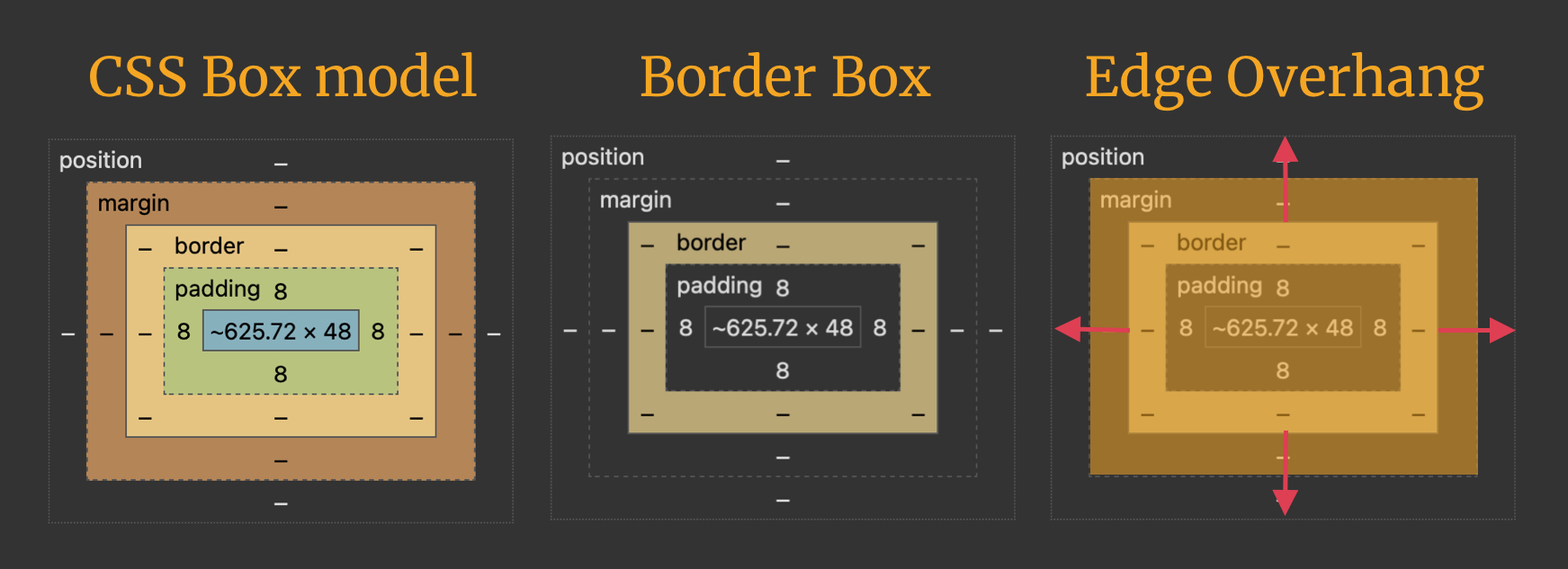
The CSS border-image-outset property sets distance between an element’s border-image area and how far it goes beyond the element’s border-box.
.container {
  border-style: ridge;
  border-width: 3rem;
  border-image-source: url('path/to/image.jpg');
  border-image-slice: 70;
  border-image-width: 40%;
  border-image-repeat: repeat;
  border-image-outset: 2;
}The border-image-outset property is defined in the CSS Backgrounds and Borders Module Level 3 specification. It is referred to as the “Edge Overhang” property, which perfectly describes what it’s designed to do: allow the border image area to hang over an element’s border box.

Syntax
border-image-outset: [<length [0,∞]> | <number [0,∞]>]{1,4}- Initial value:
0 - Applies to: all elements (including the
::first-letterpseudo-element), except internal table elements whenborder-collapseis set tocollapse. - Inherited: no
- Percentages: n/a
- Computed value: four values, each a number or absolute length
- Animation type: by computed value
border-image-outset accepts between one and four values, much like the margin and padding shorthand properties:
- One value: Sets all four sides at the same outset distance.
- Two values: The first value sets the outset for the top and bottom sides; the second value sets the outset for the left and right sides.
- Three values: The first value sets the outset for the top side; the second value sets the outset for the right and left sides; the third sets the outset for the bottom side.
- Four values: Sets the outset for each side in clockwise order, starting from the top side (top, right, bottom, and left, in that order).
Values
/* Length value (includes unit) */
border-image-outset: 2rem;

/* Number value (unitless) */
border-image-outset: 2;

/* Single value: Sets all four sides */
border-image-outset: 2;
border-image-outset: 2rem;
border-image-outset: 32px;

/* Two values: top and bottom | left and right */
border-image-outset: 4 6rem;
border-image-outset: 2 3rem;
border-image-outset: 1 24px;

/* Three values: top | left and right | bottom */
border-image-outset: 4rem 2 5rem;
border-image-outset: 5 8rem 10rem;
border-image-outset: 3 6 9;

/* Four values: top | right | bottom | left */
border-image-outset: 15 4rem 4 10rem;
border-image-outset: 2 5 13rem 4;
border-image-outset: 2 5 3 7rem;

/* Global values */
border-image-outset: inherit;
border-image-outset: initial;
border-image-outset: revert;
border-image-outset: revert-layer;
border-image-outset: unset;
<length [0,∞]>
A length is a number with any CSS unit — like 10px, 1.35rem, 50%, 25dvh, etc — and is used to set the height and width dimensions of the image’s outset.
.container{
  /* Sets dimensions on all four sides */
  border-image-outset: 2rem;
}
The example above specifies a 2rem unit length for the top, right, bottom, and left outsets of the border. So, each side is 2rem in length.
<number [0,∞]>
A number is exactly like a <length> value, only without a CSS unit. When we set a unitless number for the property value, that number is relative to the border-width value. The used value is equal to the border-image-outset value multiplied by the border-width value.
border-image-outset = <number> * border-widthSay we have the following style rule:
.container {
  border-image-outset: 4;
  border-width: 1rem;
}
We multiply the border-image-outset unitless <number> value (4) by the border-width value (1rem), which gives us a a border image offset grand total of 4rem.
border-image-outset = 4 * 1rem = 4remborder-image-outset vs. border-image-width
They’re not the same, of course, though they behave similarly in some respects when it comes to their values. For example, both properties accept <length> and <number> values, and up to four values in a single declaration.
However, the differences between the two properties are evident in the way each property uniquely affects a part of the border image. border-image-width affects the the physical dimension of the border image area. border-image-outset affects the distance between the border image and the content box, allowing the border image to extend beyond the border box.
A few things to keep in mind
A few more things about the border-image-outset property worth knowing:
- It’s essential to set the
box-sizingof elements toborder-box, i.e.,* { box-sizing: border-box; }. This prevents borders and padding from adding to the physical width of the element and the element appearing larger than it should. - Negative values are not allowed.
- A
border-imagethat renders outside the border box does not trigger scrolling. Overflowing portions are invisible to mouse events and do not capture events. - Even though they never cause a scrolling mechanism, outset images may still be clipped by an ancestor element or by the viewport.
Demo
Change the border-image-outset, border-image-width, and border-width values below to see how each input affects the image size.
Browser support
More information
- CSS Backgrounds and Borders Module Level 3 (W3C specification)
- Understanding
border-image(CSS-Tricks) - How To Add Border Images and Gradient Borders with Pure CSS (DigitalOcean)
Related
border
.element { border: 3px solid #f8a100; }
border-image-width
.element { border-image-width: 4rem; }
border-image-repeat
.element { border-image-repeat: repeat; }
border-image-slice
.element { border-image-slice: 30%; }
border-image-source
.element { border-image-source: url('path/to/image.webp'); }
box-sizing
.element { box-sizing: border-box; }
