UGURUS offers elite coaching and mentorship for agency owners looking to grow. Start with the free Agency Accelerator today.
The shape-outside property controls how content will wrap around a floated element’s bounding-box. Typically this is so that text can reflow over a shape such as a circle, ellipse or a polygon:
.element {
  float: left;
  shape-outside: circle(50%);
  width: 200px;
  height: 200px;
}
It’s important to note that this property will only work on floated elements for now, although this is likely to change in the future. The shape-outside property can also be manipulated with transitions or animations.
Values
circle(): for making circular shapes.ellipse(): for making elliptical shapes.inset(): for making rectangular shapes.polygon(): for creating any shape with 3 or more vertices.url(): identifies which image should be used to wrap text around.initial: the float area is unaffected.inherit: inheritsshape-outsidevalue from parent.
The following values identify which reference of the box model should be used for positioning the shape within:
margin-boxpadding-boxborder-box
These values should be appended to the end, for instance: shape-outside: circle(50% at 0 0) padding-box. By default the margin-box reference will be used.
ellipse()
.element {
  shape-outside: ellipse(150px 300px at 50% 50%);
}
The ellipse() function requires the radii values for the x, y axis of the ellipse followed by the coordinates to position the center of the shape within its bounding box. For instance the example above will position the center of the ellipse in the vertical and horizontal center of the .element div:
Although the demo above may suggest that we’re changing the shape of the div itself, if we add borders and a background-image we’ll find that the bounding box is in fact still rectangular:
It might be better to think of it this way: with the shape-outside property we’re changing the relationship of other elements around an element, not the geometry of the element itself. To fix that we’ll need to use shape-outside alongside the clip-path() property, such as in this example:
circle()
.element {
  shape-outside: circle(50%);
}
This function creates a circle, and in the code example above it will create a circle with a radius that is half the height and width of .element. The circle() function can also use the same syntax for positioning the shape within.
url()
.element {
  shape-outside: url('circle.png');
}
In this instance, we have two floated images, one on either side of a block of text. Since both images have the shape-outside property set then the text beneath will avoid those two floats.
It’s also possible to set the shape-image-threshold property which will inform the browser which pixels, depending on their transparency, should create the shape. For example:
.element {
  shape-outside: url('image.png');
  shape-image-threshold: 0.5;
}
In this example the only pixels that will create the shape must have 50% transparency and above. Values from 0.0 (transparent) to 1.0 (opaque) are valid.
polygon()
.element {
  shape-outside: polygon(0 0, 0 200px, 300px 600px);
}
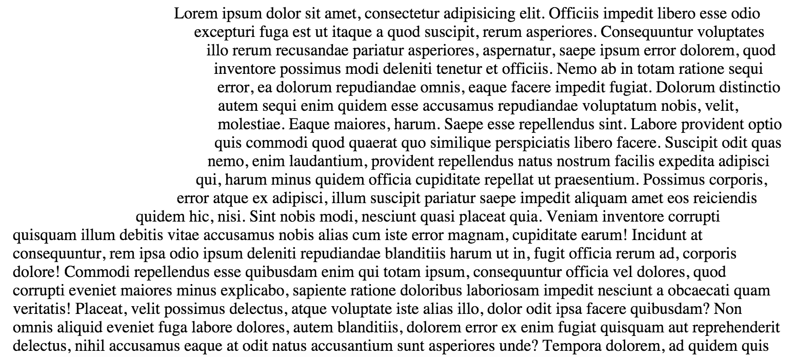
This function creates any shape that has three or more vertices, for example:
It’s important to note that if this property is going to be animated it requires the same number of vertices when you declare the animated state:
.element {
  shape-outside: polygon(0 0, 100% 0, 100% 100%, 0 100%);
  transition: shape-outside 1s;
}
.element:hover {
	shape-outside: polygon(0 0, 100% 50%, 100% 50%, 0 100%);
}
inset()
.element {
  shape-outside: inset(100px 100px 100px 100px 10px);
  /* shape-outside: inset(top right bottom left border-radius); */
}
inset() is a function for making rectangular shapes, it takes five parameters but the fifth, for border-radius is optional. The other arguments are offsets inwards from edge of .element:
Above we have an element that is 200px wide by 200px tall and we’re offsetting the shape within to 50px in every direction except the left side. This way the text will wrap above the shape even though the div extends to the top.
Related properties
Other resources
Browser support
This browser support data is from Caniuse, which has more detail. A number indicates that browser supports the feature at that version and up.
Desktop
| Chrome | Firefox | IE | Edge | Safari |
|---|---|---|---|---|
| 37 | 62 | No | 79 | 7.1* |
Mobile / Tablet
| Android Chrome | Android Firefox | Android | iOS Safari |
|---|---|---|---|
| 115 | 115 | 115 | 8* |

Any idea when FF will be supporting shape-outside ?
This feature is implemented behind the preference layout.css.shape-outside.enabled, defaulting to false, since Firefox 53.
It’s just been enabled in Nightly Builds,
Hi!
does not work
correctly
Hello, is there a way to use shape-outside. circle property with grid? I have designed page using grid layout but i want to wrape text around an image just like using float but i know floats doesnt work with grid. how do you guys reach that result with grid? thanks
Hi! Awsome tricks,! I’ve used some on my website. If possible could you point me to any guide that does the same for a video instead of an image?
react native help
const float = {
shape-outside: polygon(10px 10px, 90px 50px, 40px 50px, 90px 90px, 10px 90px),
width: 10,
height: 10,
shape-margin: 10
};
on chrome it’s not working with url(png path)?