CSS Grid is a collection of properties designed to make layout easier than it’s ever been. Like anything, there’s a bit of a learning curve, but Grid is honestly fun to work with once you get the hang of it. One area where it shines is dealing with headers and footers. With a little adjustment in our thinking, we can pull off headers and footers that behave like they are fixed, or have that “sticky” treatment (not position: sticky, but the kind of footer that hugs the bottom of the screen even if there isn’t enough content to push it there, and is pushed away with more content).
Hopefully this sparks further interest in modern layouts, and if it does, I can’t recommend Rachel Andrew’s book The New CSS Layout strongly enough: it covers both of the major modern layout techniques, grid and flexbox.
What we’re making
Let’s implement a fairly classic HTML layout that consist of a header, main content and footer.
We’ll make a truly fixed footer, one that stays at the bottom of the viewport where the main content scrolls within itself, as needed, then later update the footer to be a more traditional sticky footer that starts at the bottom of the viewport, even if the main content is small, but gets pushed down as needed. Further, to broaden our exposure to grid, let’s design our main content holder so that it can either span the whole width of the viewport, or take up a nicely centered strip down the middle.
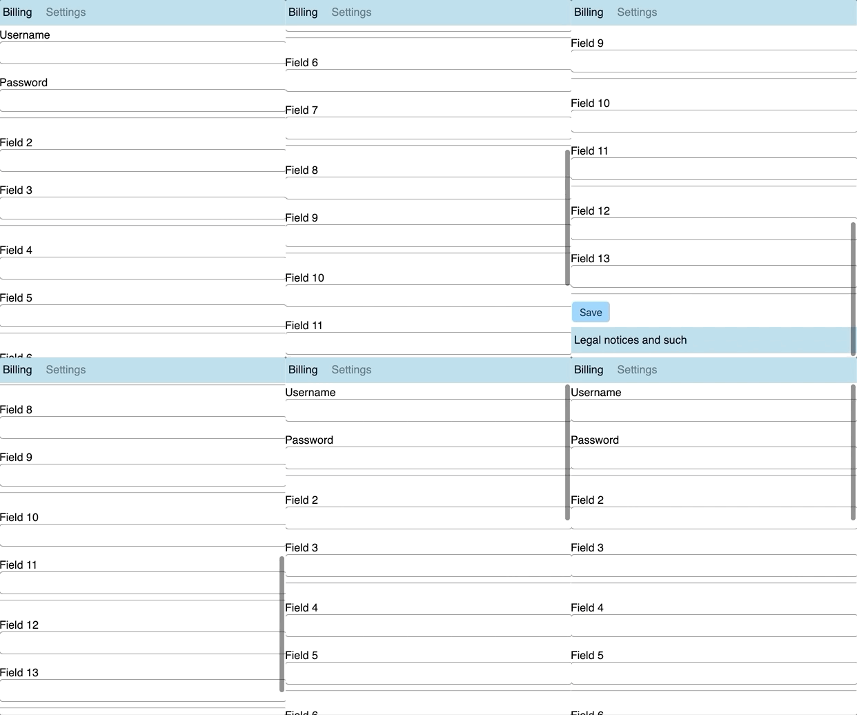
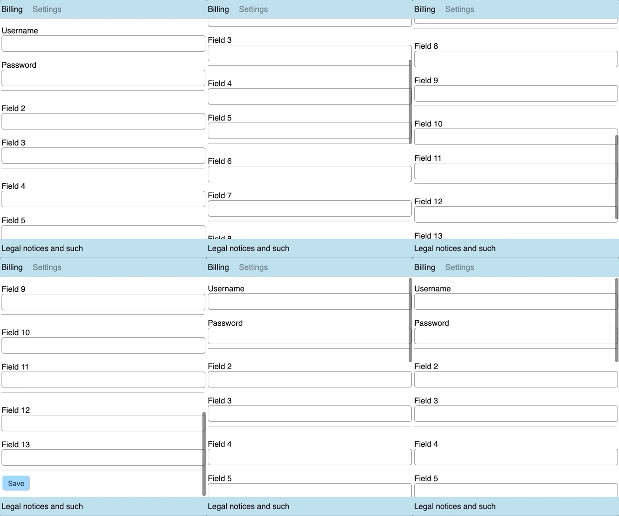
A fixed footer is slightly unusual. Footers are commonly designed to start at the bottom of the viewport, and get pushed down by main content as needed. But a persistent footer isn’t unheard of. Charles Schwab does it on their homepage. Either way, it’ll be fun to implement!
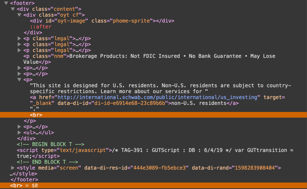
But before we move on, feel free to actually peek at the fixed footer implemented on the Charles Schwab site. Unsurprisingly, it uses fixed positioning, which means it has a hard-coded size. In fact, if we crack open DevTools, we see that right off the bat:
body #qq0 {
  border-top: 4px solid #133568;
  background-color: #eee;
  left: 0;
  right: 0;
  bottom: 0;
  height: 40px!important;
}
Not only that, but there’s the balance of making sure the main content doesn’t get hidden behind that fixed footer, which it does by setting hard-coded paddings (including 15px on the bottom of the <footer> element), margins (including 20px on <ul> in the footer), and even line breaks.
Let’s try to pull this off without any of these restrictions.
Our baseline styles
Let’s sketch out a bare minimum UI to get us started, then enhance our grid to match our goals. There’s a CodeSandbox below, plus additional ones for the subsequent steps that get us to the end result.
First, let’s do some prep work. We’ll make sure we’re using the whole height of the viewport, so when we add our grid, it’ll be easy to put the footer at the bottom (and keep it there). There’s only going to be one element inside the document’s <body> with an ID of #app, which will hold the <header, <main> and <footer> elements.
body {
  margin: 0; /* prevents scrollbars */
}


#app {
  height: 100vh;
}
Next, let’s set up our header, main, and footer sections, as well as the grid they’ll all sit in. To be clear, this will not work the way we want right out of the gate. It’s just to get us started, with a base to build from.
body {
  margin: 0;
}


#app {
  height: 100vh;

  /* grid container settings */
  display: grid;
  grid-template-columns: 1fr;
  grid-template-rows: auto 1fr auto;
  grid-template-areas:
    'header'
    'main'
    'footer';
}


#app > header {
  grid-area: header;
}


#app > main {
  grid-area: main;
  padding: 15px 5px 10px 5px;
}


#app > footer {
  grid-area: footer;
}
We’ve created a simple one-column layout, with a width of 1fr. If that 1fr is new to you, it essentially means “take the remaining space” which, in this case, is the entire width of the grid container, #app.
We’ve also defined three rows:
#app {
  /* etc. */
  grid-template-rows: auto 1fr auto;
  /* etc. */
}
The first and third rows, which will be our header and footer, respectively, are sized with auto, which means they’ll take up as much space as needed. In other words: no need for hard-coded sizes! This is a super important detail and a perfect example of how we benefit from using CSS Grid.
The middle row is where we’ll put our content. We’ve assigned it a size of 1fr which, again, just means it takes up all of the remaining space that’s left over from the other two rows. If you’re wondering why we aren’t making it auto as well, it’s because the entire grid spans the viewport’s whole height, so we need one section to grow and fill up any unused space. Note that we do not have, nor will we ever need at any point, any fixed heights, margins, paddings — or even line breaks! — to push things into place. Such is the good life when working with grid!
Shall we try some content?
You’ll notice in the Sandbox that I used React to build this demo, but since this isn’t a post about React, I won’t belabor those details; React has absolutely nothing to do with any of the CSS Grid work in this post. I’m only using it as an easy way to navigate between different chunks of markup. If you hate React, that’s fine: hopefully you can ignore it in this post.
We have Header, Main and Footer components that render the expected <header> , <main> and <footer> elements, respectively. And, of course, this all sits inside our #app container. Yes, in theory, #app should be an <article> element, semantically speaking, but that’s always looked weird to me. I just wanted to covey these details so we’re all one the same page as we plow ahead.
For the actual content, I have Billing and Settings sections that you can navigate between in the header. They both render fake, static content, and are only meant to show our layout in action. The Settings section will be the content that we put in a centered strip on our page, Billing will be the one that spans our whole page.
Here’s the Sandbox with what we have so far.
The Billing section looks good, but the Settings section pushes our footer off screen. Not only that, but if we scroll, the entire page scrolls, causing us to lose our header. That may be desirable in some cases, but we want both the header and footer to stay in view, so let’s fix that.
Fixed header, fixed footer
When we initially set up our grid, we gave it a height of 100vh, which is the entire height of the viewport. We then assigned the rows for the header and footer an auto height, and the main a height of 1fr to take up the remaining space. Unfortunately, when content exceeds the space available, it expanded beyond the viewport bounds, pushing our footer down and out of view.
The fix here is trivial: adding overflow: auto will cause our <main> element to scroll, while keeping our <header> and <footer> elements in place.
#app > main {
  grid-area: main;
  overflow: auto;
  padding: 15px 5px 10px 5px;
}
Here’s the updated demo that puts this to use.
Adjustable width main section
We want our <main> element to either span the whole width of the viewport, or be centered in a 600px space. You might think we could simply make <main> a 600px fixed width, with an auto margins on either side. But since this is a post about grid, let’s use moar grid. (Plus, as we’ll see later, a fixed width won’t work anyway).
To achieve our centered 600px element, we’ll actually make the <main> element a grid container. That’s right, a grid within a grid! Nesting grids is a totally legit approach, and will even get easier in the future when subgrid is officially supported across browsers. In this scenario, we’ll make <main> a grid with three column tracks of 1fr 600px 1fr or, stated simply, 600px in the middle, with the remaining space equally divided on the sides.
#app > main {
  display: grid;
  grid-template-rows: 1fr;
  grid-template-columns: 1fr 600px 1fr;
}
Now let’s position our the content in the grid. Our different modules all render in a <section> child. Let’s say that by default, content will occupy the middle section, unless it has a .full class, in which case it will span the entire grid width. We won’t use named areas here, and instead specify precise grid coordinates of the form [row-start] / [col-start] / [row-end] / [col-end]:
#app > section {
  grid-area: 1 / 2 / 1 / 3;
}


#app > section.full {
  grid-area: 1 / 1 / 1 / 4
}
You might be surprised to see a col-end value of 4, given that there’s only three columns. This is because the column and row values are column and row grid lines. It takes four grid lines to draw three grid columns.
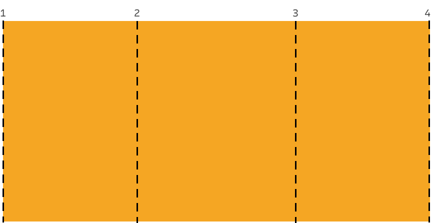
Our <section> will always be in the first row, which is the only row. By default it’ll span column lines 2 through 3, which is the middle column, unless the section has a full class on it, in which case it’ll span column lines 1 through 4, which is all three columns.
Here’s an updated demo with this code. It’ll probably look good, depending on your CodeSandbox layout, but there’s still a problem. If you shrink the display to smaller than 600px, the content is abruptly truncated. We don’t really want a fixed 600px width in the middle. We want a width of up to 600px. It turns out grid has just the tool for us: the minmax() function. We specify a minimum width and a maximum width, and the grid will compute a value that falls in that range. That’s how we prevent the content from blowing out of the grid.
All we need to do is swap out that 600px value with minmax(0, 600px):
main {
  display: grid;
  grid-template-rows: 1fr;
  grid-template-columns: 1fr minmax(0, 600px) 1fr;
}
Here’s the demo for the finished code.
One more approach: The traditional fixed footer
Earlier, we decided to prevent the footer from being pushed off the screen and did that by setting the <main> element’s overflow property to auto.
But, as we briefly called out, that might be a desirable effect. In fact, it’s more of a classic “sticky” footer that solves that annoying issue, and places the footer on the bottom edge of the viewport when the content is super short.
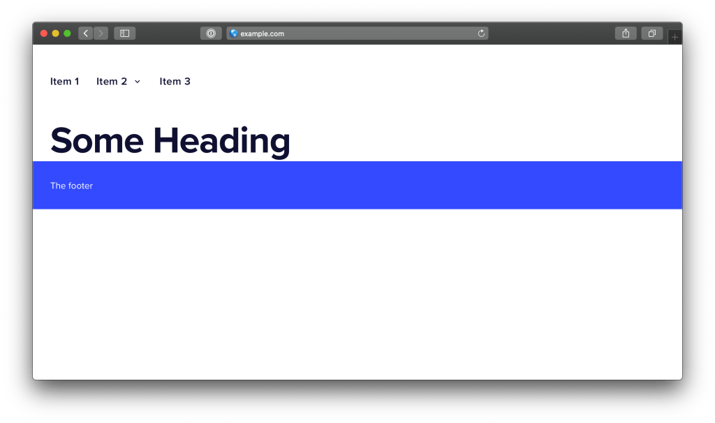
How could we keep all of our existing work, but allow the footer to get pushed down, instead of fixing itself to the bottom in persistent view?
Right now our content is in a grid with this HTML structure:
<div id="app">
  <header />
  <main>
    <section />
  </main>
  <footer />
</div>
…where <main> is a grid container nested within the #app grid container, that contains one row and three columns that we use to position our module’s contents, which go in the <section> tag.
Let’s change it to this:
<div id="app">
  <header />
  <main>
    <section />
    <footer />
  </main>
</div>
…and incorporate <footer> into the <main> element’s grid. We’ll start by updating our parent #app grid so that it now consists of two rows instead of three:
#app {
  /* same as before */


  grid-template-columns: 1fr;
  grid-template-rows: auto 1fr;
  grid-template-areas:
    'header'
    'main';
}
Just two rows, one for the header, and the other for everything else. Now let’s update the grid inside our <main> element:
#app > main {
  display: grid;
  grid-template-rows: 1fr auto;
  grid-template-columns: 1fr minmax(0, 600px) 1fr;
}
We’ve introduced a new auto-sized row. That means we now have a 1fr row for our content, that holds our <section>, and an auto row for the footer.
Now we position our <footer> inside this grid, instead of directly in #app:
#app > footer {
  grid-area: 2 / 1 / 3 / 4;
}
Since <main> is the element that has scrolling, and since this element now has our footer, we’ve achieved the sticky footer we want! This way, if <main> has content that exceeds the viewport, the whole thing will scroll, and that scrolling content will now include our footer, which sits at the very bottom of the screen as we’d expect.
Here’s an updated demo. Note that the footer will be at the bottom of the screen if possible; otherwise it’ll scroll as needed.
I made a few other small changes, like minor adjustments to paddings here and there; we can’t have any left or right paddings on <main>, because the <footer> would no longer go edge-to-edge.
I also made a last-minute adjustment during final edits to the <section> element—the one we enabled adjustable width content on. Specifically, I set its display to flex, its width to 100%, and its immediate descendant to overflow: auto. I did this so the <section> element’s content can scroll horizontally, within itself, if it exceeds our grid column boundary, but without allowing any vertical scrolling.
Without this change, the work we did would amount to the fixed footer approach we covered earlier. Making section> a flex container forces its immediate child — the <div> that contains the content — to take up all of the available vertical space. And, of course, setting that child div to overflow: auto enables scrolling. If you’re wondering why I didn’t just set the section’s overflow-x to auto, and overflow-y to visible, well, it turns out that’s not possible.
Parting thoughts
We haven’t done anything revolutionary in this post, and certainly nothing that couldn’t be accomplished before CSS Grid. Our fixed width <main> container could have been a block element with a max-width value of 600px, and auto margins on the left and right. Our fixed footer could have been made with position: fixed (just make sure the main content doesn’t overlap with it). And, of course, there are various ways to get a more traditional “sticky footer.”
But CSS Grid provides a single, uniform layout mechanism to accomplish all of this, and it’s fun to work with — honestly fun. In fact, the idea of moving the footer from fixed to sticky wasn’t even something I planned at first. I threw it in at the last minute because I thought the post was a bit too light without it. It was trivial to accomplish, basically moving grid rows around, not unlike putting lego blocks together. And again, these UIs were trivial. Imagine how brightly grid will shine with more ambitious designs!

Always returning for articels like this one
Great Article Adam. Thanks a lot. But am confused by this bit:
#app > footer {
grid-area: 2 / 1 / 2 / 4;
}
isn’t it supposed to be:
#app > footer {
grid-area: 2 / 1 / 3 / 4;
}
Sorry am a newbie to CSS
Hi! Actually, I’m not quite sure, but I’m checking on it now. It would seem as though you’re right, but what I have appears to work, too. I’m checking on whether what I had is actually spec’d and correct, or just some sort of undefined implementation detail that happened to work out. Even if the former I’m thinking I might adjust to be clearer.
Thanks for calling it out.
It should be grid-area: 2 / 1 / 3 / 4; as otherwise you are trying to start and end on the same row line. As you always have to span at least one track, it’s working as it’s being ignored so treated as span 1. Would be the sort of thing that would be nice for DevTools to pick up, they don’t seem to even if I use the longhands.
Example 35 in the spec has an example of spanning the same start and end lines listed as an error: https://www.w3.org/TR/css-grid-1/#grid-placement-span-int
What always bothers me with sticky footers is the behavior on mobile. This demo, for example, does not work very well on Chrome or FF on Android. In my experience, iOS browsers are even harder to working well. I think these layouts will always suffer as long as we have app drawers and address bars that disappear/reappear as users scroll the viewport!
That’s actually a good point. It’s frustrating and I may actually add a note pointing this out. Thanks!
There is actually something for that situation. You can use 100dvh which stands for 100 device viewport height and it will calculate the actual height of the available screen, without the address bar or similar. Browser support is getting good except IE and Opera :)
When using dvh use vh as well:
height: 100vh;
height: 100dvh;
if the browser does not understand dvh the vh version will stand.
For the deeper understanding dvh will change as the keyboard appears and lowers on a mobile device.
Interesting article, thanks!
I’m wondering how you would take it a step beyond your second example (if it’s possible,) and add content below the footer that gets pushed off the screen by the main content.
So you’d have a footer that sticks, but also content below it that does not stick.
You could think of it like a collapsible footer that only shows it’s sub-content if the main area is scrolled up far enough to reveal it.
A footer-footer that lives in the same scroll container :)
Hi Adam,
Beware that
<header /><main /><footer />has not the same semantic meaning than<header /><main>...<footer/></main>. It’s bad development practice to me!Aye, there’s the rub. I read this article carefully, fully intending to implement, then I got to this non solution. You can have the layout you want if don’t mind confusing screen reader users! Adam, mention at the outside of the post that your solution nests the footer in main, so readers who have to implement correct semantics can move on.
Tried this trick once and scrapped it, because it breaks keyboard scrolling: up/down/page up/page down/space for page down. No matter how cool, if an idea breaks accessibility, it’s not worth it.
No keyboard scrolling works fine with that
Looks super interesting. I wish you added some HTML code to the post instead of (uniquely) codesandbox links. The links force me to jump from tab to tab.
Subgrid link (mozilla site) doesn’t work, new link:
https://developer.mozilla.org/en-US/docs/Web/CSS/CSS_Grid_Layout/Subgrid
Thanks Adam, your post helped me to solve a problem.
Here I tried to extract the gist of your blog: https://dev.to/xaverfleer/how-i-use-css-grid-for-sticky-headers-2ong
Curious what you think of it.
Scrolling overflow content without polling, calculating, and setting height?
Wow!
Simple, minimal, natural (non-JS), cross browser solution to an otherwise everyday annoyance.
Thank you!
#app {
height: 100vh;
}
Should be
#app {
min-height: 100vh;
}
otherwise the header will be scrolled in some cases despite “position: sticky”.
Similar case:
https://stackoverflow.com/questions/30227863/sticky-position-header-scrolled-away-after-a-while